Analytics professional with 3+ years of experience across healthcare AI, fintech, and banking compliance. IEEE and Springer published researcher. I build systems that turn messy, uncertain data into decisions that matter — from graph-grounded clinical AI to LP-optimized supply chains.
Open to roles in Data Science, ML Engineering & Analytics.
Replaced probabilistic RAG with a Neo4j knowledge graph mapping 129,000+ PrimeKG disease-drug-protein entities to eliminate hallucination in clinical diagnosis. Generated validated diagnosis lists via Cypher + LLaMA 3 with chain-of-thought prompting. Deployed via Ollama on A2A cloud — HIPAA-compliant inference, zero PHI to external APIs. Cut manual billing review by 40% across 10,000+ monthly claims. Flagged insurance fraud mismatches in 10,000+ monthly referral records.
Neo4jPrimeKGLLaMA 3QwenOllamaCypherRAGHIPAA
Viai Solutions
Data Scientist Intern
Jan–Aug 2024 · Fintech
Dual-frequency Bitcoin price pipeline with S&P 500 correlation features. 0.06 RMSE daily, ~65% directional accuracy using Bi-LSTM over SARIMAX and ARIMA. Streamlit dashboard consolidating live feed, cross-market correlations, and forecast vs actuals.
Bi-LSTMSARIMAXTensorFlowStreamlit
Azentio Software
Data Scientist Intern
Jan–Jul 2023 · Banking AML
spaCy NER pipelines detecting banned entities in SWIFT transaction narration fields for OFAC compliance. Enhanced Levenshtein distance with contextual information for improved financial entity classification.
spaCyNEROFACSWIFTAML
Northeastern University
Graduate Teaching Assistant
Jan 2026–Present · DBMS / Stats
TA for database design, advanced SQL/NoSQL, and business statistics. Corrected errors in 30+ student projects.15% improvement in course performance metrics. Built Oracle SQL window function curriculum. Senator of Technology, Northeastern Graduate Student Government.
Oracle SQLNoSQLMongoDBANOVAERD Design
02 / ML PROJECTS
Click Any Card → Full Case Study
Deep Learning · Computer Vision · Edge AI · IEEE
IgnisAI
97.7% recall — zero missed fires in network-isolated UAV conditions
MobileNetV2 on 19,913 drone images. Chose 14MB model over 88MB alternative — intentional 1% accuracy tradeoff for 4× edge footprint reduction. IEEE published at AWS/Microsoft/IBM-backed conference.
MobileNetV2DockerIEEE
IEEE Published5 sectionsGitHub
ML · Fraud Detection · Ensemble · Real-Time API
SentinelPay
~$67,896 fraud prevented — 92% recall at 0.172% fraud rate
Solved model collapse at extreme imbalance using SMOTE-ENN + class weight tuning + threshold optimization. XGBoost/LightGBM/CatBoost ensemble deployed via FastAPI + Docker.
XGBoostSMOTE-ENNFastAPI
3 sectionsGitHub
Explainable AI · Public Sector · SHAP
FedAuditAI
2–3 weeks → <1 hour audit triage on $41.43T DoD obligations
Caught 86 target leakage instances inflating accuracy 90%+. Rebuilt with 67 clean features. XGBoost + SHAP + live 6-tab React dashboard deployed on Vercel.
Tiered imputation preserved 98% signal. LightGBM beat XGBoost 10× on RMSE stability (0.03 vs 0.30). EBM + SHAP + LIME explainability stack. Published Springer LNNS.
LightGBMEBMSpringer
Springer · SCOPUS4 sectionsGitHub
Integer Programming · Stochastic Optimization
NBA Broadcast Optimizer
474.44 expected value — IP solved across 256 playoff calendars
4⁴=256 Round 1 scenarios. Separate binary IP per scenario. 6-factor objective: team interest, competitiveness, slot value, game probability, round weight, leverage.
PuLPBinary IP256 Scenarios
4 sections
Ensemble ML · Astronomy · EDA-Driven
Kepler Classifier
<1% false positives — 7% over RF on 9,500 Kepler objects
EDA revealed multicollinearity + high dimensionality → ruled out parametric models. 4-model Voting Classifier (XGB + LGB + AdaBoost + RF) across 49 features.
XGBoostLightGBMVoting Classifier
3 sectionsGitHub
NLP · Sentiment Analysis · Time-Series ML · Plotly Dash
CrowdPulse
68.7% F1 — does Twitter mood predict next-day stock direction?
End-to-end pipeline across 20 tickers, 5 years. Synthetic tweets calibrated to real financial Twitter distributions. Chronological holdout. LR beats RF. Bloomberg Terminal-inspired live dashboard deployed on Vercel.
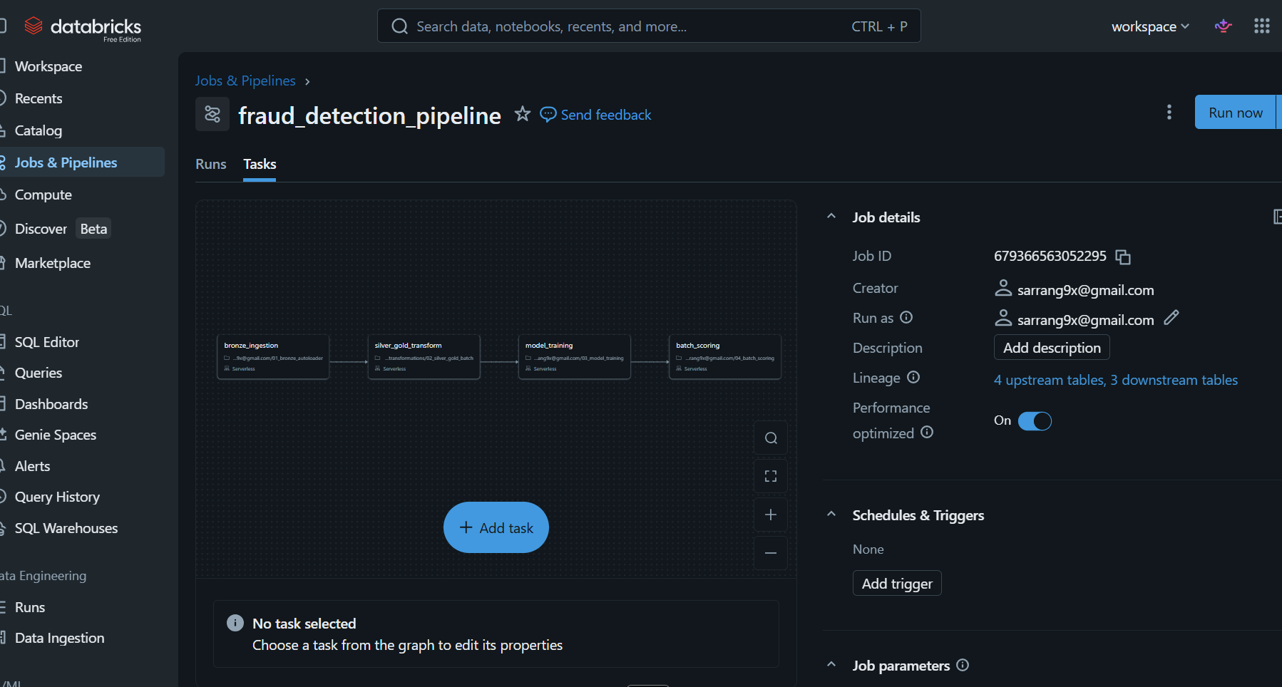
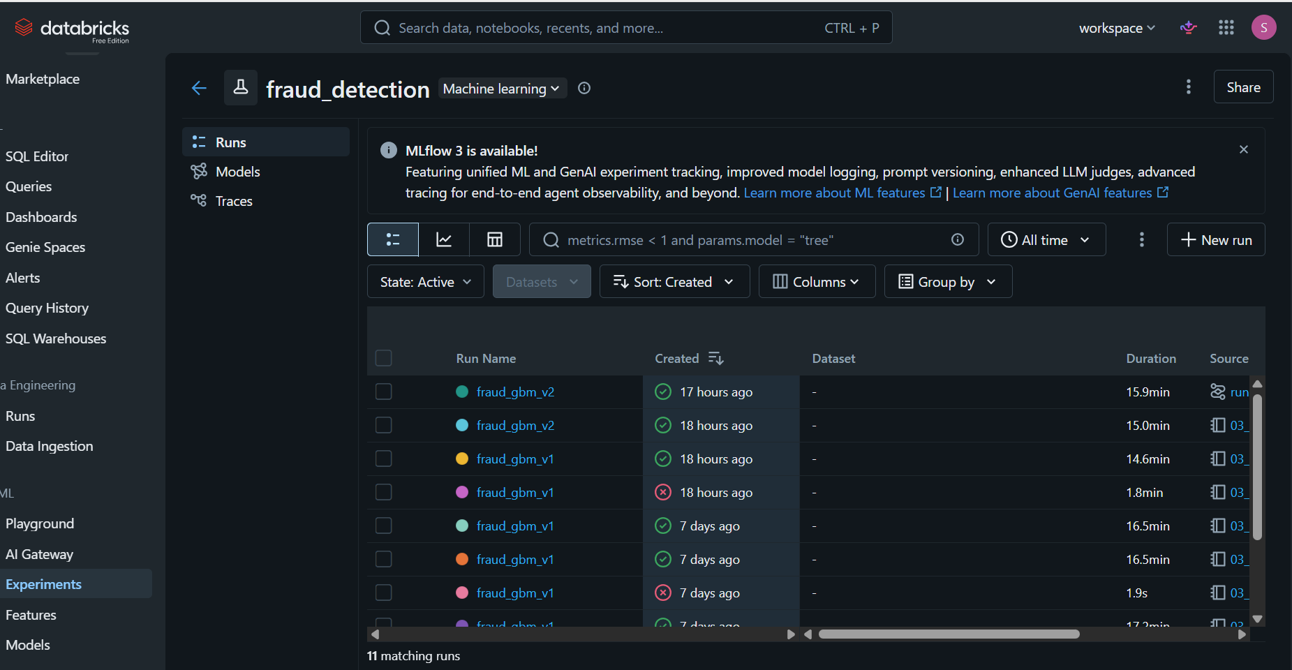
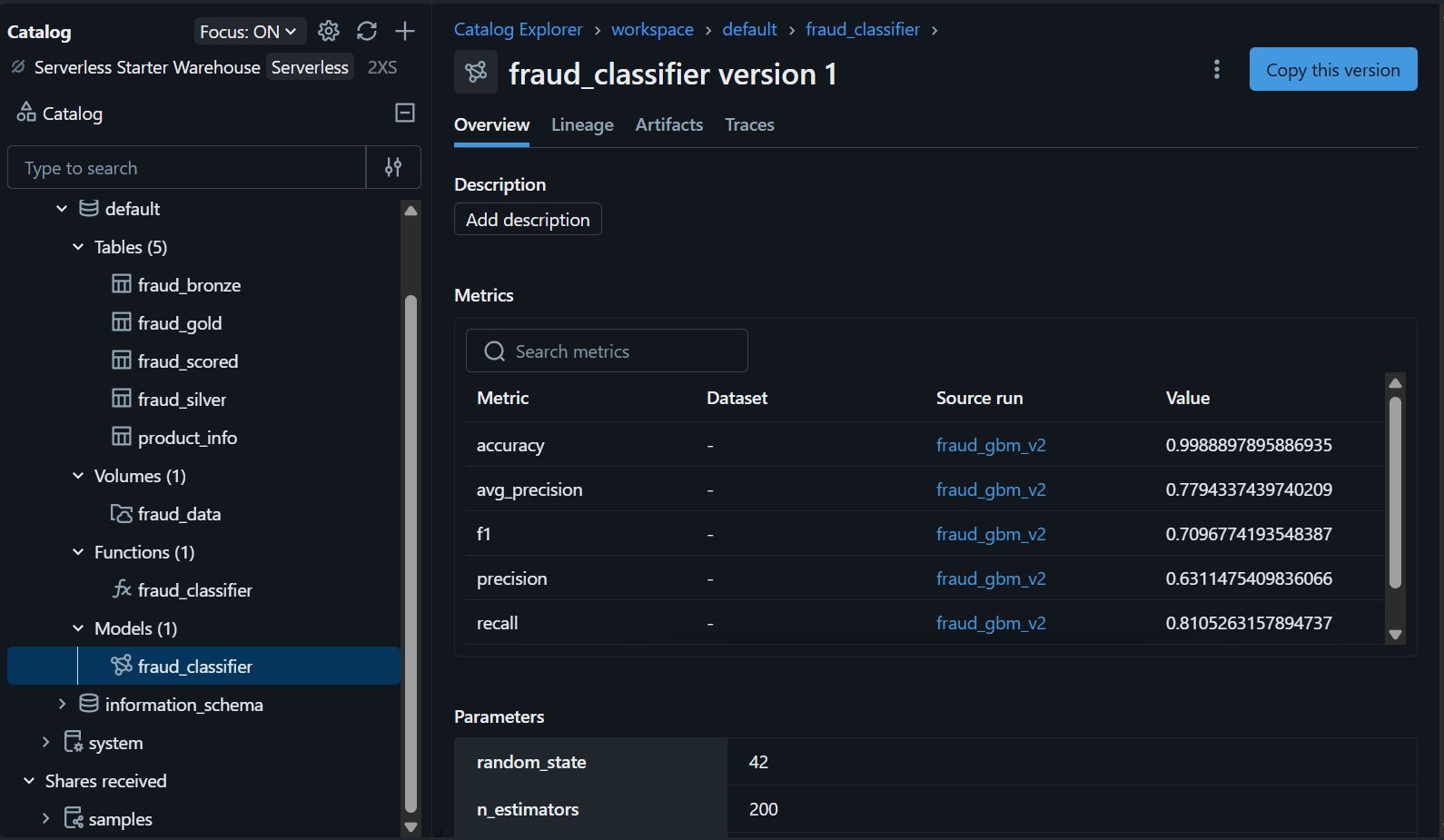
0.9585 ROC-AUC — end-to-end Bronze → Silver → Gold → ML in 18 minutes
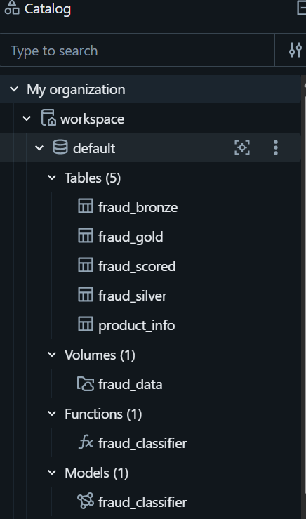
Auto Loader ingestion → PySpark Medallion transforms → GradientBoosting with MLflow tracking → Unity Catalog model registry → batch scoring. 284,807 transactions, 0.17% fraud rate. All 4 tasks orchestrated as a single Databricks Job.
LP space allocation across Receiving, Storage, Picking, VAS, Office. Sensitivity analysis: expanding to 140K sq ft yields $1.23M more. Shadow price: $71.75/sqft on receiving constraint.
LPExcel SolverSensitivity Analysis
5 sections
Linear Programming · Energy Mix · Environmental Constraints
MidAtlantic Power
$1,798,000/week minimum cost — 5-source generation mix with CO₂ cap
Minimization LP across coal, gas, nuclear, wind, solar. CO₂ shadow price $52/ton. Tighter regulation by 2,000 tons adds $104K/week. Python/PuLP with dual value interpretation.
LPPuLPEnergy Policy
4 sections
LP · Make vs Outsource · Manufacturing
Rougir Cosmetics
$584,473 optimal production cost — make-vs-outsource LP across 2 shifts
Per-unit cost derived from raw material inputs and shift-specific labor rates. LP determines optimal allocation of face/body/hand cream production across Shift 1 and 2 given capacity constraints.
IP optimal 155.5 vs greedy 148.5 — 4.5% gap analysis across 6 teams
Binary IP vs 2-pass greedy heuristic for 6-team basketball bracket. Both satisfy all constraints. Rigorous analysis of when heuristics beat exact solvers in time-critical scheduling.
Binary IPGreedyComparison
4 sections
Monte Carlo · DCF Valuation · Stochastic Simulation
Netscape IPO Simulation
Was $28/share justified? Stochastic DCF across 8 uncertain parameters
Modeled Netscape 1995 IPO under uncertainty: revenue growth N(65%,5%), R&D triangular(32%,42%), market premium uniform(5%,10%), plus 5 more stochastic parameters. Quantified price-per-share distribution.
Monte CarloDCFPython
4 sections
04 / STRATEGY & AI ANALYTICS
MIT CISR Case Studies — Data Strategy & AI Product Analysis
AI at Scale · MLOps · Product Health KPIs · Model Lifecycle
Cemex AI at Scale
$30M value from 200+ production AI models — engagement, quality, latency, and cost tracked across 21 countries
Analyzed how Cemex industrialized AI across the order-to-fulfillment process. Focused on KPI design for AI feature health, model drift management via MLOps, and the organizational structure needed to sustain interdependent production models at global scale. MIT CISR Working Paper No. 463.
AI Product KPIsMLOpsMIT CISR
MIT CISR6 sections2 tables
Data Monetization · Expert Solutions · Improve-Wrap-Sell
Wolters Kluwer
58% of €5.6B revenues from expert solutions — 20-year data monetization transformation from publisher to AI platform
Applied the MIT CISR improve→wrap→sell framework to analyze WK's FCC division. Examined how feature-level engagement tracking, customer segmentation, and AI instrumentation translated operational data into monetizable expert solutions driving 8% organic growth. MIT CISR Working Paper No. 465.
Data MonetizationImprove-Wrap-SellMIT CISR
MIT CISR6 sections
Capability Assessment · Data Maturity · Analytics Strategy
CarMax Data Capability
Advanced data science, foundational acceptable use — 4-dimension maturity gap analysis identifying the constraints on monetization potential
Applied the MIT CISR Data Monetization Capability Assessment to CarMax's omni-channel transformation. Rated data management, platform, data science, and acceptable data use — and identified why Advanced data science paired with Foundational governance is the most strategically dangerous configuration. Based on Data Is Everybody's Business.
Capability AssessmentData StrategyMIT CISR
MIT CISR5 sections
05 / SUPPLY CHAIN
Operations, Strategy & Disruption Analysis
Geospatial ML · Network Analysis · Federal Data · Capstone
ClearPath Analytics
Dallas-Fort Worth costs $5.28T to reroute — not the highest-risk corridor by score
Random Forest (90.3% LOOCV) + gravity model + NetworkX failure simulation across 134 U.S. freight corridors. $18.04T in freight analyzed. Live automated weekly digest deployed via GitHub Actions.
Random ForestNetworkXCensus CFS API
Live dashboardMiro + Figma18-section deep-diveGitHub
Two labs hit capacity at ~450 stores — 900-store target requires doubling lab network
Lab-capacity constraint model quantifying the binding throughput ceiling in Warby Parker's vertical integration strategy. Demand forecasting framework + progressive-lens mix analysis. Q1 2026 10-Q sourced.
Capacity ModelingDemand PlanningDTC Strategy
7 sections2 tables
Stage-Gate · CPM · Product Development · Ivey Case
Acme Medical Imaging
A mid-project chipset pivot reset 16-week lead times — no one modeled the impact first
Root cause analysis of a WiMAX medical device launch failure. Stage-Gate process design + CPM scheduling to prevent unilateral CEO decisions from cascading through procurement and assembly timelines.
Stage-GateCPMRACI
5 sections2 tables
Distributed Inventory · Customer Profitability · HBS Case
Halloran Metals
40% of revenue from accounts under $20K/year — most are unprofitable after fulfillment cost
Strategic and operational analysis of a steel service center facing a 70% profit drop. Distributed inventory vs centralized model comparison, Worcester shuttle economics, and customer profitability segmentation.
In-stock from 75% to 96% — CPFR with 150 EDI vendors rebuilt a business E&B nearly destroyed
Analysis of West Marine's supply chain transformation: multi-echelon JDA replenishment, CPFR rollout across 350+ vendors, and 60-day integration playbook for the Boat U.S. acquisition.
CPFRMulti-EchelonAcquisition
5 sections
IT-SC Alignment · ERP · Data Warehouse · Ivey/NEU Case
KL Worldwide
$311M private-label channel blind — no cross-facility SCM visibility across 4 global M&D centers
IT-supply chain alignment analysis using McFarlan's IRM framework. SAP vs Oracle ERP gap mapping, EDW investment roadmap, and prioritized 24-month implementation sequence for a $1B sports apparel company.
IRM FrameworkSAP SCMEDW
6 sections2 tables
06 / MORE COURSEWORK
Additional Analyses
01
Acadia Coffee Blend LP
Profit max: $2,461.22. Shadow price: Costa Rican beans $11.07/lb (binding), Mexican $0 (non-binding). Solved both PuLP and scipy.optimize with verified identical results.
LP · PuLP
02
Campus Coffee Revenue Simulation
500-day sim. Exp interarrival μ=0.8 min. 5% catering orders (Exp μ=$75). Mean $3,835 · Std $452 · 5th–95th: $3,148–$4,593. Validated against analytical expectations.
Monte Carlo
03
COVID-19 Healthcare Capacity Risk
R²=0.74 regression — bed count and staffing ratios as top mortality predictors in 50 counties. K-means identified 10 highest-risk counties for emergency deployment. Certificate of Merit, CBIT.
Regression · Clustering
04
AHP Value-Based Task Optimizer
Multi-criteria decision tool using Analytic Hierarchy Process + stochastic optimization to prioritize tasks by aligned values under uncertainty. Operations Research course capstone.
AHP · Stochastic Opt
05
Binary Variables in Optimization Models
Big-M formulations for fixed costs, min/max usage thresholds, quantity discounts, and conditional logic. Implemented and verified in Python with constraint satisfaction checks.
Binary IP · Big-M
07 / RESEARCH
Peer-Reviewed Publications
IEEE
A Deep Learning Approach to Forest Fire Detection and Monitoring
Presented at ICAICCIT 2023 — IEEE Delhi Section conference backed by AWS, Microsoft, and IBM. CNN-based UAV fire detection via MobileNetV2 transfer learning on 19,913 drone images. 97.7% recall, edge-deployed via Docker, zero missed fires in network-isolated conditions.
Peer to Peer Lending: Machine Learning Insights for Enhanced Understanding
Presented at ICCIDE-2024, VIT-AP University. Published in Springer Lecture Notes in Networks and Systems. Indexed in SCOPUS and EI Compendex. EBM + SHAP + LIME explainability framework across 179,235 Bondora records — 95% precision on high-risk borrowers.
Deep Learning · Computer Vision · Edge AI · IEEE Published 2023
IgnisAI
Cut wildfire false alarms by 97.7% — deployed a 14MB model running with zero missed fire detections in completely network-isolated forest conditions.
97.7%
Recall Rate
14MB
Edge Model Size
19,913
Training Images
0
Missed Fires
4×
Smaller Than Best Alt.
The Problem
Wildfires Kill Fast. Detection Can't Depend on the Cloud.
Forest departments use UAV surveillance for early wildfire detection — but traditional systems produce massive false alarm rates, causing alert fatigue and wasting emergency crews. The harder problem: UAVs patrol remote forests where network connectivity is unreliable or absent. A system requiring cloud inference has a single catastrophic point of failure.
The data problem was equally hard. No single open dataset covered fire scenarios across the full range of lighting conditions, drone angles, fire sizes, and smoke densities that field deployments encounter.
The Creative Approach
The Best Model Isn't the Most Accurate One
The headline insight was an engineering tradeoff decision. Xception hit 98.8% accuracy but weighed 88MB. MobileNetV2 hit 97.8% at 14MB. On a UAV with constrained storage and no internet, a 4× smaller model that still nearly tops benchmarks is the correct call. Sacrificing 1% accuracy to achieve deployability is not a limitation — it's the design.
To build robustness across scenarios, I combined three separate datasets into a 19,913-image pipeline and applied shear, zoom, and horizontal flip augmentation to simulate the real-world variation in how fire appears from different drone angles and lighting conditions.
Model
Accuracy
Size
Edge Viable
Decision
Xception
98.8%
88MB
No
Rejected
MobileNetV2 ✓
97.8%
14MB
Yes
Selected
Step 1
3 Datasets → 19,913 Images
→
Step 2
Augmentation Pipeline
→
Step 3
MobileNetV2 Fine-Tune
→
Step 4
Docker Container (14MB)
→
Step 5
Network-Isolation Test
Edge Validation
Simulated Zero-Network Forest Deployment
Containerized the model with Docker and used Docker network isolation to completely cut off external connectivity — simulating a UAV deep in a forest with no signal. The model processed GPS-tagged images from local storage only. No API calls. No cloud. Zero missed fire detections. This removes the network as a single point of failure by design.
Results
The Numbers
97.7%
Recall — real fires correctly flagged across 20,000+ drone images
4×
Smaller model than the best alternative, enabling UAV edge deployment
0
Missed fire detections under Docker-isolated, network-free test conditions
ML · Fraud Detection · Ensemble Methods · Real-Time API
SentinelPay
Prevented ~$67,896 in potential fraud — 92% recall on 284,807 transactions at a 0.172% fraud rate that causes most models to collapse.
$67,896
Fraud Loss Prevented
92%
Recall on Fraud
453/492
Cases Caught
284,807
Transactions
The Core Problem
Model Collapse at 0.172% Fraud Rate
The dataset had 284,807 transactions with only 492 fraudulent — a 0.172% fraud rate. At this imbalance, naive classifiers predict "not fraud" every time and achieve 99.8% accuracy while catching zero fraud. This is model collapse. The standard fix — SMOTE alone — is insufficient because it creates synthetic samples without cleaning borderline majority-class cases.
The Approach
Three-Layer Imbalance Strategy
Combined three mechanisms simultaneously: SMOTE-ENN (oversample rare fraud + edit borderline majority samples), class weight tuning (penalize minority misclassification), and precision-recall threshold optimization (find the F1-maximizing operating point instead of defaulting to 0.5). The ensemble — XGBoost, LightGBM, CatBoost — was deployed as a containerized FastAPI endpoint with Streamlit frontend.
The Department of Defense has failed its audit every year since 2018. The dataset covers 24,517 transactions across 160+ programs, 286 spending categories, and fiscal years 2010–2023 — totalling $41.43T in obligations. Manual audit triage takes 2–3 weeks per cycle. Auditors can only review a fraction of accounts. The goal: build a risk scorer that is honest, interpretable, and trusted in a federal context.
Critical Discovery
I Caught 86 Leakage Instances Before They Reached Production
During feature engineering, 3 discrepancy features were inadvertently computed using the target variable — audit_outcome. This is target leakage. A leaked model scores nearly perfectly in backtesting but fails entirely on real, unseen data. Removing the 86 tainted instances and rebuilding with clean features dropped the apparent F1 by 32 points — but the new number is real.
State
F1 Score
Precision
Recall
Note
Before (leaked)
99.37%
99.8%
99.1%
Illusory — cannot generalize
After (clean)
66.76%
68.2%
65.4%
Honest, production-safe
The 32-point drop is not a regression — it is a correction. A model that shows 99% F1 by cheating will score near 50% on real DoD data. The 66.76% model will actually work.
Risk Scoring Design
7-Factor Binary Risk Score
Before training, each transaction receives a deterministic binary risk score (0–7) derived from domain-validated financial red flags. This transparent scoring creates an auditable baseline that works even without ML — and becomes a powerful feature inside the model.
High-risk transactions are rare by design — the original training set had a severe class imbalance (roughly 1:4). Applying SMOTE only to the training fold (never the test set) synthesized minority-class examples to balance the distribution. The test set remains the real, imbalanced world.
4,753
Original Training Samples
23,616
After SMOTE Augmentation
1:1
Balanced Class Ratio
5-fold CV
Stratified Validation
Feature Engineering
+5.34 F1 Points from 67 Engineered Predictors
Baseline XGBoost on raw features scored 61.42% F1. Incremental feature groups were added and validated against the held-out test set. The full engineered feature set reached 66.76% — a 5.34-point gain, entirely from domain knowledge translated into predictors.
Feature Group
Features Added
F1 Score
Gain
Raw baseline
12
61.42%
—
+ Ratios & rates
18
63.18%
+1.76
+ Temporal patterns
11
64.55%
+1.37
+ Risk score features
8
65.83%
+1.28
+ Program benchmarks
18
66.76%
+0.93
Total
67
66.76%
+5.34
Model Comparison
XGBoost Dominates — Logistic Regression Fails on Imbalanced Federal Data
Model
F1 Score
Precision
Recall
Note
XGBoost
66.76%
68.2%
65.4%
Selected — SHAP compatible
Random Forest
60.85%
62.1%
59.6%
Strong but lower recall
Logistic Regression
32.59%
29.4%
36.8%
Fails on non-linear patterns
XGBoost was chosen not just for performance but because it is natively compatible with SHAP — every risk prediction comes with a ranked feature contribution breakdown that auditors can read and act on.
Business Impact
$56.32M Projected Annual Savings — Prioritizing 200 Cases in Under 1 Hour
The DoD spends ~$1,200 auditor-hours per cycle on manual triage. The risk scorer reduces this to a ranked list of 200 high-risk transactions reviewed in under an hour — freeing auditors to investigate rather than search. At an average recovery of $281,600 per confirmed case, flagging 200 cases annually projects to $56.32M in recovered funds.
Explainable ML · Credit Risk · Springer Published · SCOPUS Indexed
P2P Lending Risk
95% precision on high-risk borrowers — explainable credit risk framework across 179,235 loans despite 61.6% missing values.
95%
Precision (High-Risk)
179,235
Loan Records
98%
Signal Preserved
0.03
LightGBM RMSE
The Problem
61.6% Missing Values. Real Lending Money at Stake.
179,235 Bondora P2P loan records across 8 risk categories (AA to HR) with 61.6% missing values. Standard approaches fail: naive imputation distorts signal, dropping features loses too much information. Lending models must also be explainable — regulators and borrowers need to understand high-risk classifications.
Designed a tiered imputation strategy: drop features above 92% missingness, median/mode impute for moderate gaps, add indicator variables for mid-range gaps so the model learns missingness as a signal. Power transformation for skewed distributions. 98% of signal preserved.
Chose LightGBM over XGBoost on RMSE stability grounds — 0.03 vs 0.30, a 10× improvement. In production lending, stability matters more than peak R². Explainability: EBM (glass-box), SHAP (global), LIME (local per-loan).
Model
RMSE
Decision
XGBoost
0.30
Rejected — too unstable for production lending
LightGBM ✓
0.03
Selected — 10× more stable
Key Finding
Interest Rate Is the Dominant Default Signal
SHAP global explanations showed interest rate as a consistently increasing predictor of default across all 179,235 records. Borrowers assigned higher rates are systematically more likely to default — an actionable pricing signal invisible from raw data alone.
474.44 expected broadcast value — binary IP solved across all 256 possible playoff calendars to maximize national TV value under deep scheduling uncertainty.
256
Playoff Scenarios
474.44
Expected Obj. Value
13.75
Exp. R1 Broadcasts
8.51
Exp. R2 Broadcasts
The Problem
You Have to Schedule Games That Haven't Happened Yet
National TV slots are pre-committed weeks in advance. But the NBA playoffs are stochastic: each best-of-7 series ends in 4, 5, 6, or 7 games. Round 1 lengths determine Round 2 start dates — which determines which games even exist to broadcast. Standard IP assumes a fixed calendar. This problem required optimizing against all possible calendars simultaneously.
The Model
4⁴ = 256 Scenarios × One IP Each
For each of 256 Round 1 scenarios: build a scenario-specific calendar (adjusting Round 2 starts), generate scarce East broadcast slots, solve a binary IP maximizing weighted game-slot value. Objective weights: Team Interest (Nielsen DMA × social following × Google Trends), Competitiveness (1/(seed_gap+1)), Slot Value (primetime 1.8×), Game Probability (G7=30%), Round Weight, Leverage (elimination games 1.6×). Aggregate expected value across scenarios weighted by probability.
Step 1
256 Scenarios Enumerated
→
Step 2
Conditional R2 Calendar
→
Step 3
Solve Binary IP (PuLP)
→
Step 4
Weight by P(scenario)
→
Step 5
Aggregate E[Value]
Key Finding
Competitive Series Get 2× More Coverage — Discovered by the Solver
The optimizer consistently allocated 4–5 expected broadcasts to competitive matchups and only 2 to lopsided ones. This isn't hardcoded — it emerges from the competitiveness term in the objective across all 256 scenarios.
Series
Seed Gap
Expected Broadcasts
Allocation
Cavaliers vs Hawks
4 vs 5 (gap: 1)
4.92
5/14
Knicks vs Raptors
3 vs 6 (gap: 3)
4.66
5/14
Pistons vs Hornets
1 vs 8 (gap: 7)
2.11
2/14
Celtics vs 76ers
2 vs 7 (gap: 5)
2.05
2/14
The Celtics/76ers result is counterintuitive — despite major-market appeal, a seed gap of 5 suppresses competitiveness enough that the solver consistently deprioritizes them for premium slots across all 256 scenarios. Market size alone doesn't win primetime.— Model Insight
Ensemble ML · Astronomy · EDA-Driven Model Selection
Kepler Classifier
Under 1% false positives — 7% screening efficiency improvement over Random Forest on 9,500 Kepler Objects of Interest.
<1%
False Positive Rate
+7%
Over Random Forest
9,500
Kepler Objects
49
Features
The Problem
Every False Positive Wastes Telescope Time
Kepler generated thousands of KOI signals. Each false positive that passes screening costs astronomers expensive observation time on what turns out to be noise. The classification task: distinguish confirmed exoplanets, false positives, and candidates across 9,500 objects and 49 features.
EDA-Driven Design
Model Choice Made During Exploratory Analysis
EDA revealed two structural issues: severe multicollinearity among orbital and stellar features, and high dimensionality at 49 features. Together, these ruled out logistic regression before any model was trained — unstable coefficients would produce unreliable probabilities.
Baseline Random Forest performed well but had a known boosting weakness at complex decision boundaries. Built a 4-model Voting Classifier (XGBoost + LightGBM + AdaBoost + RF) that addressed different weakness profiles across each model. Result: <1% false positives and +7% over standalone RF.
Linear Programming · Warehouse Design · Sensitivity Analysis
Harbor Logistics DC
$5,701,950 optimal annual profit — LP space allocation across 6 warehouse zones with shadow price-driven expansion analysis.
$5.70M
Optimal Annual Profit
$1.23M
Expansion Upside (20K sqft)
120,000
Sq Ft Facility
6
Operational Zones
The Business Problem
Harbor Logistics Needs to Allocate 120,000 Sq Ft for Maximum Profit
Harbor Logistics is planning a new distribution center with 120,000 sq ft across 6 zones: Receiving & Inspection, Short-Term Storage, Long-Term Storage, Order Picking & Packing, Value-Added Services, and Office Space. Each zone has a different profit per square foot. Staging areas (25% of Receiving) and aisle space (30% of Long-Term Storage) consume area without generating revenue.
The goal: determine the exact square footage for each zone to maximize annual profit while satisfying 7 operational constraints — minimum space requirements, storage ratios, VAS/Picking relationships, and equipment limits.
The LP Formulation
Decision Variables, Constraints, and Objective
Objective: Maximize 22R + 58S + 38L + 75P + 92V (profit per sq ft × allocation)
Short-Term + Long-Term ≥ 50% of total area — inventory capacity
Long-Term ≥ 30% of total storage — slower-moving items
VAS ≥ 30% of Picking area — kitting/labeling requirement
VAS ≤ 8% of total facility — specialized equipment cap
1.25R + S + 1.3L + P + V + O ≤ 120,000 — total area including staging/aisles
Optimal Solution
Zone Allocation at $5,701,950 Profit
Zone
Allocation (sqft)
Annual Profit
Profit/sqft
Receiving & Inspection
15,000
$330,000
$22
Short-Term Storage
42,000
$2,436,000
$58
Long-Term Storage
18,000
$684,000
$38
Order Picking & Packing
18,250
$1,368,750
$75
Value-Added Services
9,600
$883,200
$92 (highest)
Office Space
8,000
$0
$0
Sensitivity Analysis
Three Strategic Decisions Answered Without Re-Solving
Capacity Expansion: Shadow price on total area = $61.49/sqft. Expanding from 120K to 140K sq ft (within allowable range) adds 20,000 × $61.49 = $1,229,700 in additional annual profit. No need to re-solve — the sensitivity report answers this directly.
Picking Automation Investment: The allowable increase on the Picking coefficient is $17 — meaning Picking profit can rise from $75 to $92/sqft before the optimal zone allocation changes. If automation pushes beyond $92/sqft, the model will reallocate space to Picking.
Receiving Efficiency Upgrade: Shadow price on Receiving minimum = −$71.75. Management's proposal to lower the minimum from 15,000 to 12,000 sqft (within allowable decrease of 11,000 sqft) increases profit by 3,000 × $71.75 = $215,250.
The VAS/Picking ratio constraint has a shadow price of zero — the current optimal solution already has VAS at 9,600 sqft vs the 5,475 minimum required. Relaxing it from 30% to 25% changes nothing. The sensitivity report proves this without re-solving.— Sensitivity Analysis Finding
Stack
Built With
Linear ProgrammingExcel SolverSimplex LPSensitivity AnalysisShadow PricesAllowable Ranges
Linear Programming · Energy Mix · Environmental Policy · Python PuLP
MidAtlantic Power
$1,798,000/week minimum operating cost — optimal generation mix across 5 energy sources under CO₂ caps and renewable portfolio standards.
$1.798M
Min Weekly Cost
$52
CO₂ Shadow Price/Ton
$104K
Cost of Tighter Regs
50,000
MWh Weekly Demand
The Business Problem
MidAtlantic Power Must Meet Demand While Minimizing Cost and Emissions
MidAtlantic Power operates coal, natural gas, nuclear, wind, and solar generation. Must meet 50,000 MWh weekly demand while complying with CO₂ limits (23,000 tons/week), renewable portfolio standards (≥20% from wind/solar), grid reliability requirements (≥65% from dispatchable baseload), nuclear minimum operations (6,000 MWh), and natural gas rapid-response minimums (≥12% of total).
LP Formulation
Minimize: 32C + 58G + 42N + 12W + 15S
Decision variables: MWh generated from each source. 11 constraints capturing demand, CO₂, renewable standards, grid reliability, safety minimums, and capacity limits. Solved in Python using PuLP with CBC solver. Shadow prices extracted from dual values.
Source
Cost/MWh
CO₂ (tons/MWh)
Optimal Output
% of Total
Coal
$32
0.95
19,000 MWh
38%
Natural Gas
$58
0.45
11,000 MWh
22%
Nuclear
$42
0.00
10,000 MWh (max)
20%
Wind ✓
$12
0.00
6,000 MWh (max)
12%
Solar ✓
$15
0.00
4,000 MWh (max)
8%
Key Insight
CO₂ Regulations Force $104K/Week Cost Tradeoff
Wind, solar, and nuclear all run at maximum capacity — the solver pushes clean energy to its physical limits. Coal and gas remain high despite being cost-competitive because CO₂ limits cap their output. The CO₂ constraint shadow price is −$52/ton.
A proposed regulatory tightening from 23,000 to 21,000 tons/week (a 2,000-ton reduction) would increase weekly operating costs by 2,000 × $52 = $104,000/week. This estimate holds because the allowable decrease on the CO₂ constraint is 7,000 tons — the 2,000-ton change stays within the valid range for shadow price application.
Shadow prices on nuclear, wind, and solar capacity limits are all negative — each MWh of additional clean capacity added would reduce costs. The binding constraint isn't the company's willingness to use clean energy — it's the physical supply ceiling.
Nuclear shadow price: −$39.40/MWh. Wind: −$69.40/MWh. Solar: −$66.40/MWh. These are the investment signals: wind expansion has the highest cost-reduction potential per incremental MWh of capacity added.— Shadow Price Analysis
LP · Make vs Outsource · Manufacturing · Capacity Planning
Rougir Cosmetics
$584,473 optimal production cost — LP determines shift allocation for face cream, body cream, and hand cream when internal capacity is insufficient to meet demand.
$584,473
Optimal Production Cost
6,000
Cartons per Product
2
Labor Shifts Modeled
4
Raw Material Constraints
The Business Problem
RCI Can't Meet Demand Internally — When and How Much to Outsource?
Rougir Cosmetics International needs to produce 12,000 face cream, 8,000 body cream, and 18,000 hand cream cartons next quarter. Stage 1 alone requires 50,400 labor-hours but only 28,500 are available — RCI is 77% over capacity. Hand cream must be produced in-house due to its proprietary formula. Face and body cream can be outsourced to a local supplier (face: $40/carton, body: $55/carton) who signed a secrecy agreement.
The LP for the 6,000-carton simplified version determines the optimal Shift 1 vs Shift 2 allocation for each product given Stage 1/Stage 2 capacity constraints and four raw material limits.
Cost Derivation
Per-Unit Costs Built From First Principles
Per-carton costs were derived from raw material inputs × unit prices plus labor hours × shift wage rates. Shift 2 carries a 10% wage premium and 10% capacity reduction over Shift 1.
Product
Shift 1 Cost
Shift 2 Cost
Material Cost
Labor (S1)
Face Cream
$32.15
$34.17
$12.00
$20.15
Body Cream
$37.35
$39.81
$12.80
$24.55
Hand Cream (in-house only)
$25.53
$26.84
$12.40
$13.13
LP Formulation & Solution
Minimize Total Cost Across 6 Decision Variables
Decision variables: F1, F2, B1, B2, H1, H2 (cartons per shift per product). Objective: Minimize 32.15F1 + 34.17F2 + 37.35B1 + 39.81B2 + 25.53H1 + 26.84H2. Constraints: demand equality for each product, Stage 1/2 capacity per shift, and 4 raw material limits (water, oil, scents, emulsifiers).
Product
Shift 1
Shift 2
Why?
Face Cream
2,800
3,200
Split across shifts — labor capacity binding
Body Cream
6,000
0
All in cheaper Shift 1 — capacity allows it
Hand Cream
0
6,000
In-house only, overflows to Shift 2
The solver never chose Shift 2 for body cream because Shift 1 had sufficient remaining capacity after face cream was allocated. The LP naturally finds that cheaper labor should be used to capacity before triggering the premium shift.— Optimal Solution Interpretation
Stack
Built With
Linear ProgrammingExcel SolverSimplex LPMake vs Buy AnalysisCost Derivation
Hit the >1,000kg pricing tier (₹90 vs ₹130/kg) — road-routing consolidation across 3 Indian cities cuts freight costs while managing 2% delay risk.
₹4.13M
Weekly Shipping Cost
₹90/kg
Achieved Rate Tier
3
Indian Cities Optimized
2%
Delay Probability Modeled
The Business Problem
DGF Is Overpaying Because Shipments Don't Consolidate Well
DHL Global Forwarding consolidates shipments from 13 clients across Hyderabad, Bengaluru, and Chennai, shipping to Frankfurt daily (Tuesday, Thursday, Saturday). Airlines charge tiered rates: ≤100kg costs ₹130/kg; >1,000kg costs only ₹90/kg with Qatar Airways. On certain days, shipments accumulate at one city — preventing the company from reaching the cheaper tiers at that location.
The question: can road-routing shipments overnight between cities (at ₹4–9/kg) allow DGF to consolidate into larger batches at cities with more frequent cheap-carrier slots — achieving the ₹90/kg tier more consistently?
The Analysis
City-Level Consolidation Weights and Pricing Tiers
City
Daily Weight
Shipment Day
Best Rate
Best Airline
Hyderabad
2,800 kg
Tue/Thu/Sat
₹100/kg
Emirates
Bengaluru
2,500 kg
Tue/Thu/Sat
₹90/kg
Qatar Airways
Chennai
3,500 kg
Tue/Thu/Sat
₹90/kg
Qatar Airways
All three consolidated city shipments exceed 1,000 kg — hitting the lowest pricing tier. The road-routing question becomes: can moving Hyderabad's shipments (at ₹9/kg) to Bengaluru or Chennai unlock a better airline slot on days when Emirates isn't available, saving more than the road cost?
Risk Modeling
Expected Cost Formula With 2% Delay Probability
Road transportation introduces delay risk: traffic congestion or accidents occur ~2% of the time. When delays happen, DGF pays a penalty equal to the full shipping cost of the delayed consignment.
This risk-adjusted framework identifies consolidation routes that remain profitable even under uncertainty — not just in the base case. Sensitivity analysis on the delay probability identifies the breakeven point at which road-routing stops being cost-effective.
The industry norm is a 5-day maximum transit time from origin to destination airport. Road routing between Indian cities (overnight, ~12 hours) fits well within this window — the transit constraint is non-binding.— Constraint Analysis
Competitive Advantage Analysis
DGF's Edge Isn't the Rates — It's the Network Design
Airline cargo rates are essentially commoditized across forwarders. DGF's advantage comes from two things: (1) intelligently routing shipments to leverage road cost differentials between cities (Bengaluru→Chennai: ₹4/kg vs Hyderabad→Bengaluru: ₹8/kg), and (2) timing consolidation to match high-frequency low-cost airline slots. Competitors with less sophisticated routing algorithms pay the same rates but miss the consolidation opportunities.
Stack
Built With
Transportation Network AnalysisExcelExpected Value ModelingSensitivity AnalysisRisk-Adjusted Costing
IP optimal: 155.5 vs greedy: 148.5 — rigorous 4.5% gap analysis with two-pass heuristic design for 6-team basketball scheduling.
155.5
IP Optimal Value
148.5
Greedy Value
4.5%
Optimality Gap
90
Binary Decision Variables
The Problem
Schedule a 6-Team Tournament to Maximize Spectator Value
6 teams (Eagles, Hawks, Falcons, Pelicans, Ravens, Condors), 2 courts, 6 time slots (9AM–7PM), 9 total games. Each team plays exactly 3 games. No rematches. At least 1 game per slot. At most 2 games per slot. Game value = (Time Slot Value × Competitiveness) + Average Fan Interest.
Time slot values range from 1 (9AM) to 8 (7PM). Competitiveness: 3 pts if rank difference ≤2, 2 pts if difference = 3, 1 pt otherwise.
Binary IP Formulation
15 Matchups × 6 Slots = 90 Binary Variables
Decision variable x(i,t) = 1 if matchup i is scheduled in slot t. With 15 possible matchups and 6 time slots, there are 90 binary variables. Objective: maximize ΣΣ [(S_t × C_i) + F_i] · x_it. Constraints: slot capacity ≤2, each team plays exactly 3 games, each matchup at most once, at least one game per slot, no team in two games simultaneously.
Slot
IP Schedule
Greedy Schedule
7PM (value 8)
Eagles vs Hawks + Falcons vs Pelicans
Eagles vs Hawks + Falcons vs Pelicans
5PM (value 6)
Eagles vs Falcons + Cavaliers vs Hawks
Eagles vs Falcons + Ravens vs Condors
3PM (value 4)
Hawks vs Falcons + ...
Hawks vs Pelicans + Eagles vs Condors
9AM (value 1)
Pelicans vs Condors
Hawks vs Ravens
Greedy Innovation
Two-Pass Algorithm to Guarantee All Slots Filled
The naive greedy approach — fill best matchups into highest-value slots first — violates the "at least one game per slot" constraint because it exhausts all teams before reaching the 9AM slot. The solution: a two-pass algorithm.
Pass 1: For each slot (7PM → 9AM), select one game that prioritizes teams with the fewest games scheduled so far, ensuring every slot gets at least one game. Pass 2: Fill remaining slot capacity greedily by highest spectator value.
This design guaranteed constraint satisfaction while recovering 148.5 out of the 155.5 IP optimal — a 95.5% approximation ratio.
The greedy gap isn't a failure — it's the expected cost of computational simplicity. The IP solver considers the full joint scheduling space; the greedy algorithm makes locally optimal decisions without global lookahead. A 4.5% gap is competitive for a heuristic with this level of constraint complexity.— Algorithm Comparison
Monte Carlo Simulation · DCF Valuation · Stochastic Modeling
Netscape IPO Simulation
Was the $28/share IPO justified? Stochastic DCF modeling across 8 uncertain parameters quantified the true distribution of Netscape's 1995 value.
$27.82
Deterministic Price/Share
$1.057B
Total NPV (Base Case)
8
Stochastic Parameters
500+
Simulation Runs
The Business Problem
Morgan Stanley & H&Q Needed to Price Netscape's August 1995 IPO
Netscape Communications' revenues had doubled every quarter in 1995, reaching $33.25M. The underwriters (Morgan Stanley and Hambrecht & Quist) used a DCF model splitting the future into a 10-year forecast period (1995–2005) and a terminal value using the perpetuity growth model. Their deterministic calculation justified $28/share on $38M shares outstanding.
The question this analysis asks: how much uncertainty surrounds that $28 figure? If key assumptions vary — revenue growth, R&D intensity, discount rate, terminal growth — what's the actual distribution of price per share, and was the $28 offering price justified?
Stochastic Parameters
8 Uncertain Inputs, Each with Its Own Distribution
Parameter
Distribution
Range / Parameters
Revenue Growth Rate
Normal
μ=65%, σ=5%
R&D Expenses (% revenue)
Triangular
min=32%, mode=36.76%, max=42%
Market Risk Premium
Uniform
5% to 10%
Risk-Free Rate
Triangular
min=6%, mode=6.71%, max=7.5%
TV Growth Rate
Discrete Uniform
1%, 2%, ..., 10% (equal probability)
Capital Expenditures
Uniform
±1 pp from base schedule
Other Operating Expenses
Uniform
±1 pp from base schedule
Depreciation
Uniform
4.5% to 6.5% of revenues
The Model
FCF → NPV → Price Per Share, Repeated Stochastically
For each simulation run: sample all 8 parameters from their distributions → project revenues (1995–2005) using sampled growth rate → compute FCF each year (net profit + depreciation − capex) → calculate terminal value using perpetuity growth model → discount all flows to NPV → divide by 38M shares for price/share.
The deterministic base case yields $27.82/share — nearly exactly the $28 IPO price. The Monte Carlo simulation reveals how sensitive this number is to the joint uncertainty across all 8 parameters. Key question: what fraction of simulated scenarios produce price/share ≥ $28?
Step 1
Sample 8 Parameters
→
Step 2
Project Revenues 1995–2005
→
Step 3
Compute FCF per Year
→
Step 4
Terminal Value (Perpetuity)
→
Step 5
NPV / 38M Shares
The TV/NPV ratio in the base case is 0.77 — 77% of Netscape's value comes from cash flows after 2005. This makes the price/share distribution extremely sensitive to the terminal growth rate assumption, which is modeled as discrete uniform across 1–10%. A 3% shift in terminal growth can swing the price per share by $10+.— Simulation Sensitivity Finding
Stack
Built With
PythonNumPyMonte Carlo SimulationDCF ModelingPerpetuity Growth ModelStochastic DistributionsExcel
Geospatial ML · Network Analysis · Federal Data · Business Analytics Capstone · MISM 6214
ClearPath Analytics
Ranked all 134 U.S. freight corridors by disruption risk — from Miro process map to Figma brief to Random Forest classifier to live Streamlit dashboard. The highest-vulnerability corridor is not the most dangerous one to lose.
90.3%
RF LOOCV Accuracy
$18.04T
Freight Analyzed
$5.28T
DFW Rerouting Cost
134
CFS Areas Ranked
17,822
Corridor Pairs Modeled
5
Key Findings
Live Dashboard
ClearPath Streamlit Dashboard — Interactive Supply Chain Risk Explorer
Miro Process Map — The Full Causal Chain, START to Action
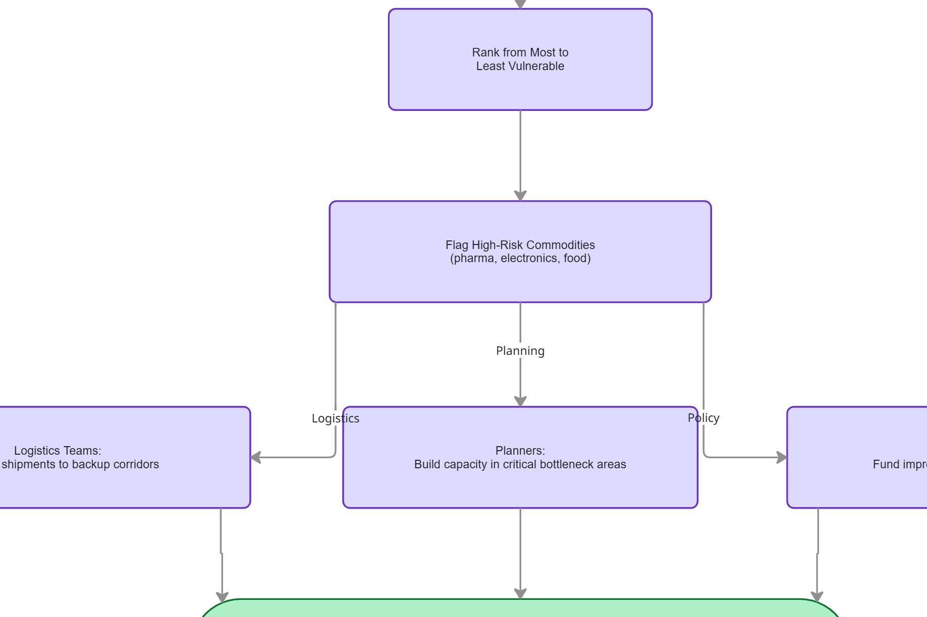
Before any modeling, the team mapped the end-to-end logic on a Miro board: START → estimate freight value per area → freight flows through the 134 CFS areas, which then forks into two lanes. The risk cascade (top) traces how high geographic concentration propagates — allocation strain → reduced freight capacity → shipment delays → inventory shortages → rising logistics costs → supply-chain vulnerability. The analytics pipeline (bottom) runs the 2022 CFS data through aggregation → value/tonnage normalization → vulnerability scoring → ranking → high-risk commodity flagging.
Both lanes converge on one decision — "which areas require action?" — routing to the three audiences the project serves: logistics teams reroute shipments to backup corridors, planners build capacity in critical bottleneck areas, and policymakers fund infrastructure improvements.
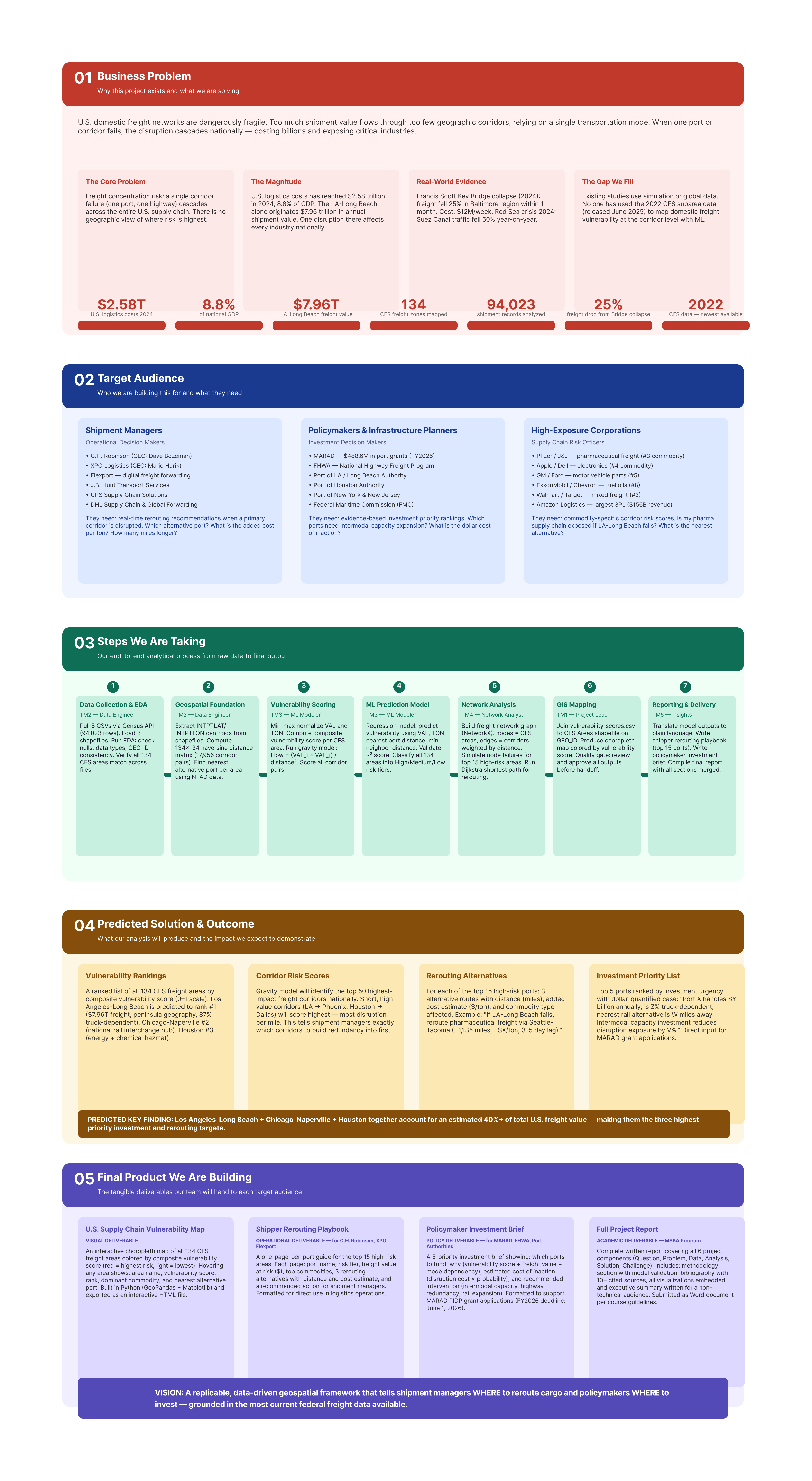
The Figma brief mapped the problem in four columns before any data was touched: Context (80% of U.S. freight flows through just 20 major hubs — which corridors would cripple supply chains if disrupted?), Operations (manufacturers → transport → major hubs → warehouses → end customers), Risk (too much freight in too few places → if one hub fails, everything stalls → trucks and trains can't move goods → deliveries take 2–3× longer → stores run out → companies lose money), and Analytics (2022 Census Freight Data → group by 134 freight areas → score vulnerability → rank → flag high-risk commodities → logistics teams reroute, planners build capacity, government funds top-10 corridors).
This framing discipline — mapping the full causal chain from disruption to economic consequence before touching data — is what kept the analysis anchored to actionable outputs rather than interesting but unusable findings.
Dashboard Screens
Nine Screens Across Six Dashboard Tabs — From Risk Overview to Commodity Deep-Dive
Each screen below is captured from the live Streamlit dashboard embedded above. Together they cover all six tabs: Overview, Network Map, Failure Simulation, Gravity Corridors, Area Deep-Dive, and Commodity Risk.
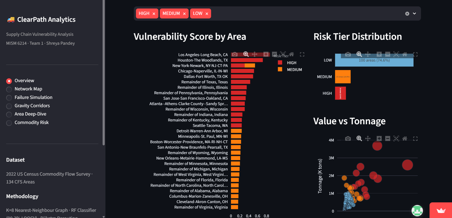
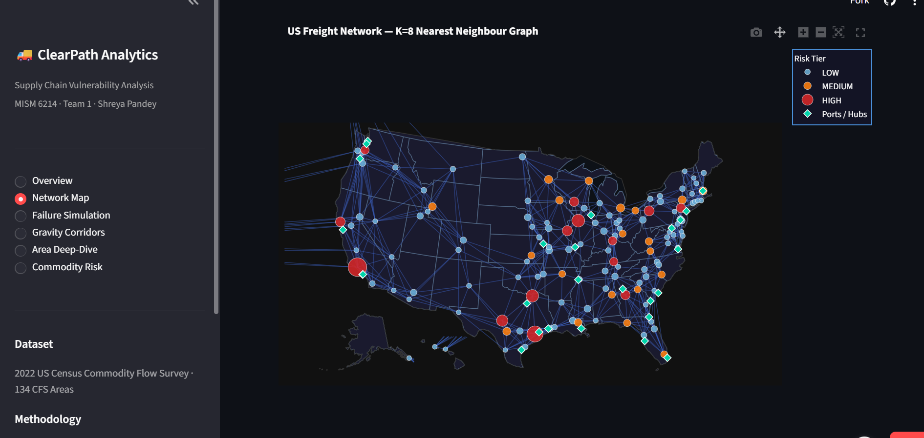
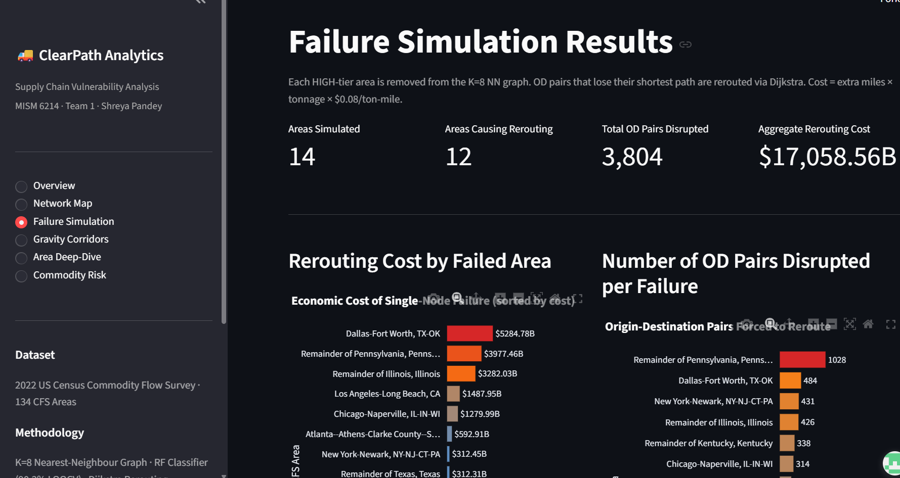
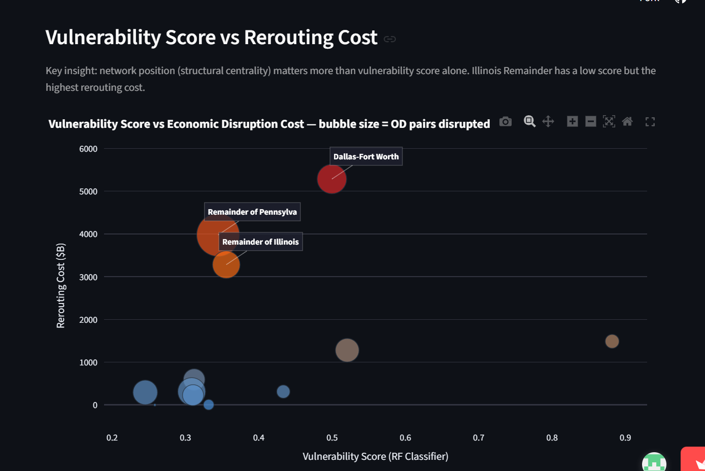
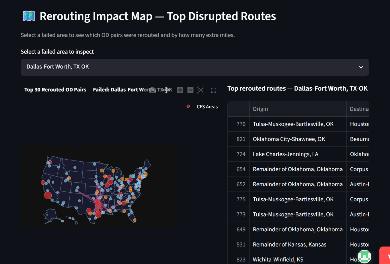
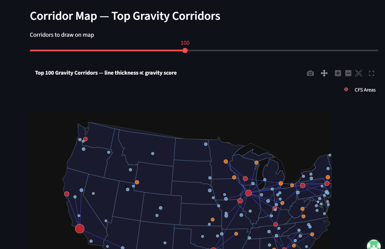
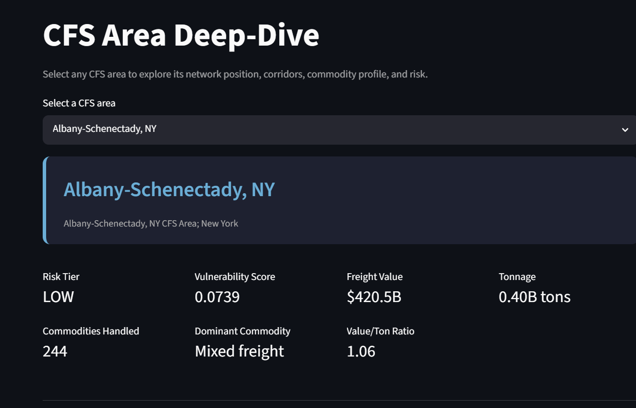
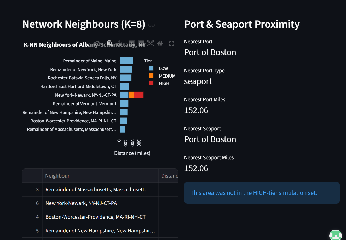
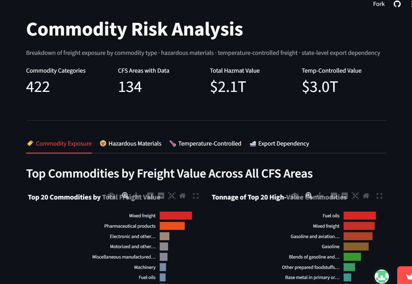
01 · OVERVIEWVulnerability Score by Area & Risk Tier Distribution. The landing tab ranks all 134 CFS areas by composite vulnerability score and shows the High / Medium / Low tier split at a glance.02 · NETWORK MAPK=8 Nearest-Neighbour Graph with Risk Tiers. The 134-node freight network — each area linked to its eight nearest neighbours and colored by risk tier.03 · FAILURE SIMULATION14 Areas, $17T Aggregate Rerouting Cost. Node-removal run across all 14 High-tier areas, aggregating the rerouting cost of every simulated corridor failure.04 · FAILURE SIMULATIONVulnerability Score vs Rerouting Cost. The headline chart — plotting score against simulated cost shows network position drives disruption more than raw vulnerability rank.05 · FAILURE SIMULATIONRerouting Impact Map — Dallas-Fort Worth. Geographic view of the origin-destination paths that reroute when DFW — the worst-case node — is removed.06 · GRAVITY CORRIDORSTop 100 Corridors by Gravity Score. The 100 highest-gravity corridors drawn on the map, line thickness scaled to each corridor's gravity score (value over distance²).07 · AREA DEEP-DIVERisk Tier, Freight Value & Tonnage per Area. Per-area drilldown — select any CFS area to inspect its risk tier, freight value, and tonnage.08 · AREA DEEP-DIVENetwork Neighbours (K=8) & Port Proximity. The selected area's eight graph neighbours and its distance to the nearest intermodal port facility.09 · COMMODITY RISK422 Categories — $2.1T Hazmat, $3T Temp-Controlled. Commodity-level breakdown across 422 SCTG categories, flagging hazmat and temperature-controlled freight exposure.
The Problem
A $12M/Week Bridge Collapse Exposed a National Blind Spot
U.S. domestic freight has a concentration problem nobody has built a tool to measure at corridor resolution. The 2024 Francis Scott Key Bridge collapse made this concrete: a single piece of infrastructure failed, regional freight dropped 25% within one month, and delay-related costs ran at an estimated $12M per week. Baltimore is not even a top-5 freight corridor by value — yet the disruption required coordinated federal and state response.
Two groups of decision-makers currently lack the tool they need. Shipment managers at firms like C.H. Robinson, J.B. Hunt, XPO, and FedEx improvise rerouting after a disruption has already begun — at the moment when costs are hardest to control. Policymakers at MARAD, FHWA, and state DOTs are distributing $488.6M in FY2026 Port Infrastructure Development Program grants without a ranked, geographically explicit vulnerability index. Without one, those decisions get driven by visibility and political attention rather than by where a failure would do the most damage.
No publicly available tool answered the core question at the geographic resolution the 2022 Census Commodity Flow Survey now makes possible. ClearPath Analytics is that tool.
U.S. logistics costs reached $2.58 trillion in 2024 — 8.8% of GDP, well above the pre-pandemic range of 7.4–7.8%. The cost of getting infrastructure priorities wrong has never been higher.
Data Pipeline
Seven Raw Sources, Five Derived Files, One Critical Bug Found and Fixed
All primary data originated from two federal agencies: the U.S. Census Bureau's 2022 Commodity Flow Survey API and the Bureau of Transportation Statistics TIGER/Line shapefile repository. The four CFS datasets were retrieved programmatically via paginated API calls (94,023 rows across multiple requests, validated against published CFS cross-tabulation totals). An early version of the extraction script had a Census API key hardcoded directly into source code — identified during code review, regenerated, and replaced with an environment variable before the repository was made public.
Raw
Census CFS API (94,023 rows)
→
Centroids
INTPTLAT/INTPTLON from shapefile
→
Distance Matrix
17,822 Haversine corridor pairs
→
Port Proximity
26 NTAD intermodal facilities
→
Features Master
21-column ML-ready table
→
Vulnerability Scores
134 CFS areas ranked
Dataset
Source
Rows
Description
cfs_freight_area.csv
Census CFS API
94,023
Freight value and tonnage by CFS area and commodity code
centroids.csv
BTS TIGER/Line shapefile
134
Census-provided INTPTLAT/INTPTLON per CFS area (post-bug-fix)
distance_matrix.csv
Team-computed
17,822
Haversine distances for all 134×133 directed corridor pairs
features_master.csv
Team-engineered
134
21-column ML-ready feature table; zero nulls
vulnerability_scores.csv
Team-computed
134
Composite vulnerability index for all 134 CFS areas
Critical Challenge
The Centroid Bug — 66 of 134 Areas Were on the Wrong Coordinates
During gravity model construction, a significant upstream error was discovered. The original centroids.csv had been geocoded by area name rather than shapefile coordinates — placing 66 of 134 areas on incorrect coordinates. Buffalo was placed on New York City's lat/lon. Baltimore was placed in South Carolina. Multiple West Coast areas collapsed onto a single California point. This corrupted 74% of all corridor distances — 13,266 of 17,822 pairs.
The fix was to read INTPTLAT/INTPTLON directly from the 2022_CFS_Areas.shp shapefile via GEO_ID join, producing zero zero-distance corridors. All four derived geo files were rebuilt and backed up as .orig.csv. The Spearman rank correlation between original and corrected vulnerability scores was ρ = 0.978 — the geographic story was preserved, but the absolute distance values and rerouting costs were only valid after the fix.
A second data quality issue was caught separately: the original vulnerability_scores.csv summed freight values across all three SCTG commodity hierarchy levels (2-digit, 3-digit, 4-digit), triple-counting most shipments and inflating the national total to $112 trillion. The corrected pipeline uses only the COMM=0 aggregate row per area, yielding $18.04T — within 8% of the BTS-published benchmark of $19.6T.
Vulnerability Scoring
Composite Index: Value 60% · Tonnage 40% — Robust Across All Weightings
Each of 134 CFS areas receives a score: vuln = (val_norm × 0.60) + (ton_norm × 0.40). Shipment value carries 60% weight because high-value freight — pharmaceuticals, electronics, motor vehicles — generates disproportionate economic disruption per unit of volume. Tonnage carries 40% to capture bulk-freight corridors where infrastructure stress is highest even when per-unit value is lower.
To validate the 60/40 weighting assumption, the composite index was run at three weight combinations (60/40, 50/50, 40/60). All three yield Spearman ρ ≥ 0.99, and 9 of the top 10 corridors remain identical across all weightings. The one corridor that shifts (Atlanta, rank 9 vs. 10 depending on weighting) has a vulnerability score within 0.02 of its neighbors. The top-10 corridor rankings are robust to weighting choice.
Rank
CFS Area
Freight Value
Vuln. Score
Tier
1
Los Angeles-Long Beach, CA
$7,963.8B
0.882
High
2
Houston-The Woodlands, TX
$4,234.6B
0.719
High
3
Chicago-Naperville, IL-IN-WI
$4,290.3B
0.521
High
4
Dallas-Fort Worth, TX-OK
$3,757.1B
0.500
High
5
Remainder of Texas
$2,166.3B
0.434
High
7
Remainder of Pennsylvania
$2,254.8B
0.345
High
14
Seattle-Tacoma, WA
$2,123.7B
0.243
High
70
Memphis-Forrest City, TN-MS-AR
$862.5B
0.085
Low ⚠️
Areas are classified into three tiers using percentile-based breaks: High (top 10%, ≥90th percentile), Medium (75th–90th), Low (below 75th). This produces 14 High-tier, 20 Medium-tier, and 100 Low-tier areas. The Gini coefficient for freight value across all 134 areas is 0.461 — concentration is real but not extreme. 66 areas are needed to cover 80% of national freight value.
Machine Learning
Random Forest Classifier: 90.3% LOOCV Across 134 Areas
With only 134 rows, standard 80/20 splits are statistically unreliable — each test set would have only ~27 samples. Leave-one-out cross-validation was used instead, where each of the 134 areas serves as its own test case exactly once. The classifier achieves 90.3% LOOCV accuracy with class_weight='balanced' to compensate for the 100:20:14 Low:Medium:High imbalance.
The relatively lower Medium-tier recall (0.55) reflects genuine ambiguity at the middle tier — scores sit between two more clearly defined extremes. Two High-tier areas (Remainder of Kentucky, Seattle-Tacoma) were predicted as Medium by the classifier; their vulnerability scores (0.2452 and 0.2427) sit just above the 90th percentile cutoff, making them genuine borderline cases rather than misclassifications.
Tonnage
0.326
Value
0.285
Num Commodities
0.187
Val/Ton Ratio
0.076
Seaport Distance
0.065
Neighbor Distance
0.042
Is Metro
0.019
Dominant Commodity
0.000
Dominant commodity type contributes exactly zero predictive importance. It's how much freight moves through a corridor — not what kind — that determines its vulnerability tier. This finding directly contradicts the intuition that pharmaceutical or electronics corridors are inherently more vulnerable than bulk-commodity corridors.
A spatial gravity model scored all 17,822 directed corridor pairs using: gravity_ij = (VAL_i × VAL_j) / distance_ij². High-gravity corridors move the most freight value over the shortest distance, making a disruption there propagate the largest economic shock. The gravity_norm column (0–1 normalized) served as the edge weight in the NetworkX graph.
The Philadelphia-Reading-Camden corridor emerged as the highest-gravity corridor nationally — specifically between the Pennsylvania and New Jersey state parts, separated by just 16.96 miles. The extremely short distance combined with high freight value at both endpoints produced a gravity score nearly twice that of the next-ranked corridor (New York-Newark NJ to New York-Newark NY at 60 miles). This correctly surfaces dense, short-haul intra-metro freight flows as the highest-impact disruption scenarios.
Network Simulation
The Counterintuitive Finding — Network Position Beats Vulnerability Score
A K=8 nearest-neighbor NetworkX graph was built with all 134 CFS areas as nodes and haversine distance as edge weights. Each of the 14 High-tier areas was simulated as a failure by removing that node, then running Dijkstra shortest-path to find all origin-destination pairs whose paths were affected. Rerouting cost was computed as: cost ($) = extra_miles × (node_TON × 1,000 short tons) × $0.08/ton-mile (BTS standard truck freight rate).
The most important finding: Dallas-Fort Worth ranks only #4 by vulnerability score but produces the single worst rerouting outcome — $5,284.78B, 484 affected OD pairs, 32,954 extra miles — because of its structural network centrality. LA-Long Beach is the #1 vulnerability area but produces only the 4th-highest rerouting cost because the K=8 topology provides multiple coastal bypass routes.
CFS Area
Vuln. Rank
Rerouting Cost
OD Pairs
Extra Miles
Dallas-Fort Worth, TX-OK
#4
$5,284.78B
484
32,954
Remainder of Pennsylvania
#7
$3,977.46B
1,028
30,695
Remainder of Illinois
#6
$3,282.03B
426
19,144
Los Angeles-Long Beach
#1
$1,487.95B
109
7,151
Chicago-Naperville
#3
$1,279.99B
314
8,759
Houston-The Woodlands
#2
— (resilient)
0
—
Seattle-Tacoma
#14
— (resilient)
0
—
Houston scores #2 by vulnerability but produces zero rerouting cost — the K=8 network absorbs its failure entirely. A lower-connectivity K=4 topology would surface Houston's fragility. The network topology assumption is itself a design choice that shapes the conclusions — this is documented as a known limitation and Phase 2 extension.
Rerouting Playbook
Alternative Corridors Pre-Identified for the Five Highest-Cost Failure Scenarios
San Jose-SF-Oakland → San Diego-Chula Vista-Carlsbad
65.6 mi
109
Chicago-Naperville, IL-IN-WI
Remainder of Illinois → Remainder of Wisconsin
27.9 mi
314
For areas embedded in dense metro clusters (Remainder of Pennsylvania, Chicago-Naperville), average added distance per shipment is under 45 miles — nearby alternatives absorb rerouted volume without large detours. For areas that are the primary node in a larger region (Dallas-Fort Worth, LA-Long Beach), added distance jumps to 65–68 miles — there is no equally positioned alternative nearby. This distinction tells a shipment manager not just which corridor to expect but how much additional transit time and cost to budget.
Hidden Risk
Memphis — Rank #70 Overall, Top 3 Nationally for Pharmaceutical Freight
Memphis-Forrest City ranks 70th of 134 by overall vulnerability score (0.0847) — firmly Low tier. A policymaker scanning the ranked table would have no reason to flag it. Yet commodity-level EDA revealed it handles 4.5% of national pharmaceutical freight value — third behind only LA-Long Beach (11.5%) and Chicago (6.3%) — because the FedEx SuperHub routes overnight pharmaceutical distribution through Memphis.
This creates a mismatch between aggregate vulnerability (Low) and commodity-specific concentration risk (Top 3 nationally). A general-purpose ranking built on total VAL and TON will always miss this kind of risk — Memphis's overall freight volume is unremarkable; it is the composition and carrier dependence that creates the exposure.
Recommended action: pharmaceutical distributors with cold-chain dependencies should treat Memphis-Forrest City as a distinct tabletop exercise scenario. Because the risk is driven by a single carrier's hub-and-spoke architecture rather than geography, the appropriate mitigation is carrier-specific: maintaining a secondary overnight carrier relationship (UPS, DHL) for time-sensitive pharmaceutical shipments.
This case illustrates why commodity-specific concentration analysis at the SCTG-4 grain — layered on top of geographic vulnerability scores — surfaces a class of hidden risks that aggregate rankings will always miss. Memphis was identified manually during EDA; a systematic SCTG-4 scan across all 134 areas is the natural Phase 2 extension.
Key EDA Findings
Five Findings That Reshaped the Original Project Framing
Freight concentration is broader than the LA-Long Beach headline. Gini coefficient = 0.461 across 134 areas. Top 5 areas hold only 17.5% of national freight value. 66 areas needed to cover 80%. Policy and rerouting playbooks must target the top 30–40 corridors — not just the top 5 ports.
Bug corrected; vulnerability ranking preserved. SCTG hierarchy triple-count inflated the original national total by 3.42×. After correction: $18.04T, within 8% of BTS benchmark. Spearman ρ = 0.978 confirms rankings hold.
Census suppression affects 45.91% of commodity rows. VAL=0 in 45.91% of rows — intentional Census suppression of small/confidential cells, not missing data. All commodity analysis uses SCTG-2 as canonical grain; SCTG-4 reserved for Memphis pharmaceutical case study only.
Pharmaceutical concentration centers on Memphis, not the Northeast. Top 5 pharma areas: LA-Long Beach (11.5%), Chicago (6.3%), Memphis (4.5%), Dallas-Fort Worth (4.2%), Boston (3.9%). Memphis is #3 because FedEx SuperHub — not because it manufactures pharmaceuticals.
Remainder-of-State zones are a distinct bulk-freight risk class. Non-metropolitan Remainder zones carry 42.9% of national tonnage despite holding 29.1% of national value. Four of top 10 vulnerability areas are Remainder zones. Structurally different risk profile from metro port corridors — requires separate policy response.
Automated Monitoring
Weekly Digest Deployed via GitHub Actions — Live BTS Freight Monitoring
digest_runner.py monitors BTS freight indicators for the top 15 CFS areas and sends email alerts when any area's weekly volume drops ≥15% below its 4-week rolling average. Deployed on GitHub Actions — no server required, runs on a weekly cron schedule pulling live BTS data.
In its first live run against real BTS data, the system correctly flagged a 74.1% week-over-week drop in the New York-Newark corridor — exactly the kind of early signal that allows a 72-hour reactive scramble to become a 4-hour execution of a pre-approved plan.
Weekly
GitHub Actions trigger
→
Pull
Live BTS freight indicators
→
Compare
vs 4-week rolling average
→
Alert
Email if drop ≥15%
→
Log
Results to digest_log.csv
Challenges
What Actually Went Wrong and How It Was Fixed
Challenge
Impact
Resolution
Centroid geocoding bug
74% of corridor distances corrupted — 13,266 of 17,822 pairs wrong
Read INTPTLAT/INTPTLON directly from shapefile via GEO_ID join; rebuilt all derived geo files
SCTG triple-counting
National freight total inflated to $112T (actual: $18.04T)
Use only COMM=0 aggregate row per area; validated against BTS benchmark
API key in source code
Security risk — Census API key hardcoded and committed to repo
Key regenerated; replaced with CENSUS_API_KEY environment variable before repo made public
Census suppression (45.91% of rows)
Commodity drilldowns unreliable below SCTG-2 for most areas
All analysis uses SCTG-2 as canonical grain; SCTG-4 only for Memphis (high volume, low suppression)
134-row dataset — CV strategy
Standard 80/20 split would produce ~27-sample test sets — statistically unreliable
Leave-one-out cross-validation — each area serves as its own test case exactly once
K=8 topology masks fragility
Houston and Seattle show zero rerouting cost — appears safe but isn't at lower connectivity
Documented as known limitation; K=4 analysis flagged as Phase 2 extension
Recommendations
Actionable Outputs for Two Audiences
Shipment Managers
Pre-negotiate backup carrier capacity on Dallas-Fort Worth first — worst simulated outcome of any corridor despite only #4 vulnerability rank. Treat Memphis as a named pharmaceutical contingency scenario. Subscribe to the automated weekly digest for 72-hour early warning.
Policymakers
Prioritize 14 High-tier areas for infrastructure investment review — Dallas-Fort Worth, Remainder of Pennsylvania, and Remainder of Illinois first. Broaden investment lens beyond the 5 largest port-city corridors. Treat rural Remainder-of-State zones as a separate investment category from metro ports.
Implementation
No new infrastructure required to begin. Weekly digest is live on GitHub Actions. Rerouting playbook and investment brief generated directly from corridor_gravity_scores.csv, risk_tier_output.csv, and failure_simulation_results.csv — all in the repo.
The same vertical integration that gives Warby Parker its $95 price point will prevent it from reaching 900 stores without doubling its lab network.
~450
Stores Before Lab Ceiling
$871.9M
FY2025 Revenue
54.0%
Q1 2026 Gross Margin
$1.6M
First-Ever Net Profit FY2025
The Strategic Thesis
Vertical Integration Is Both the Moat and the Burden
Warby Parker's founding insight was simple: EssilorLuxottica's layered markups — licensing fees, wholesale margins, third-party lab costs — turned a roughly $30 product into a $300–$500 sale. By owning frame design, two optical labs, and all retail channels, Warby Parker could sell the same product at $95 and still capture margin. The vertical integration is real and defensible.
But it converts variable markups into fixed lab and SG&A costs that only pay off at scale. Warby Parker reached its first full-year net profit in FY2025 — $1.6M on $871.9M revenue — after narrowing operating losses from -$111M (2022) to -$72M (2023) to -$30M (2024). The company turns profitable only when volume and lab utilization are high enough to absorb fixed costs. That is exactly what strong demand forecasting delivers.
The Lab Capacity Model
Current Two-Lab Network Exhausted at ~1.25x Today's Volume
Today's lab order volume is indexed at 100. Two-lab practical capacity: 125 (80% utilization, consistent with management's cited 80–85% target zone). Retail makes up ~75% of revenue. Mature stores sell far more than newly opened ones — growing to 900 stores implies approximately 2.5x today's order volume once those stores mature. The progressive lens shift from 18% to 22% adds a smaller increase (progressives take ~1.5x lab time).
Store Count
Indexed Demand
Two-Lab Capacity
Status
337 (today)
100
125
Within capacity
450–500
~125
125
Ceiling reached
700
~190
125
52% over capacity
900 (target)
~245
125
96% over capacity
Reaching 900 stores would require approximately doubling lab capacity — plausibly a third and fourth facility phased to lead, not follow, the store build. Lab capacity, not retail real estate, is the gating factor on the expansion.
Postponement Architecture
Why the Lab Is the Decoupling Point — Not the Warehouse
Warby Parker uses a postponement strategy: frames are manufactured to stock and pushed into inventory (forecastable), while lenses are manufactured to order and pulled by each customer's prescription (unforecastable). The two streams converge at the optical lab, which is the customer-order decoupling point. This is what allows mass customization of a medical device at $95 with minimal finished-goods inventory.
The tradeoff: almost no finished goods sit downstream of the lab. The network carries little slack. A critical input — custom cellulose acetate — is sourced from a single family-run Italian factory. An outage at either of the two labs would immediately cause fulfillment delays with no buffer inventory to absorb it.
Demand Forecasting Framework
Three Signal Layers Required for Effective Lab Planning
Layer
Key Signals
Planning Implication
Frame / Style Demand
Home Try-On rates, virtual try-on clicks, seasonal collections (~20/yr)
Pre-position frame inventory at regional labs before collection peak
Prescription / Lens Mix
Progressive-lens penetration (~18% of optical sales), single-vision split
Progressives take 1.5× lab time — forecasting their share is critical to throughput planning
Store Network Growth
New-store opening schedule, store maturation curve (12–24 months)
Lab capacity must be modeled against 900-store target; current two-lab structure is a bottleneck
Quality System
Remake Rate Is the Central Operational Metric — And It's Undisclosed
The industry average remake rate is ~15% of lens orders. Each remake costs an estimated $75–$250 in replacement lenses, shipping, and labor. Warby Parker does not disclose its remake rate. However, owning both labs positions it to track and act on this metric more directly than competitors who outsource fabrication. As progressive-lens mix grows from 18% to 22% — a higher-complexity, higher-remake-risk product — the remake rate becomes the single most actionable quality-and-cost lever available.
Recommendations
Eight Operational Priorities From the Analysis
Invest in demand-planning tools — connect forecasting to a live lab utilization dashboard
Add lab capacity before building stores — third and fourth labs must lead, not follow, store growth
Tie store openings to lab capacity — not just real estate availability
Regrow e-commerce — fell in Q1 2026 while stores grew; highest margin potential
Track remake rate by cause, lens type, and lab — target 5% vs 15% industry average
Add progressive-lens quality protocol — growing from 18% to 22% raises remake risk
Find a second acetate supplier — single Italian factory is a supply chain single point of failure
Build AI glasses quality framework before launch — electronics and data-privacy requirements are new territory
Stage-Gate · CPM · RACI · Product Development Operations
Acme Medical Imaging
A nine-month WiMAX medical device development collapsed when a mid-project chipset pivot reset 16-week lead times with no impact model, no CPM schedule, and no decision rights framework.
16wk
Procurement Lead Time Reset
5
Stage Gates Designed
4
Siloed Locations
2–3mo
Schedule Recovery Possible
Context
First-Mover Advantage in WiMAX Medical Imaging — Lost to Process Failure
Acme Medical Imaging produced DICOM-based wireless imaging products competing against GE, Siemens, and Philips. WiMAX (IEEE 802.16) represented a critical first-mover opportunity — the company reaching market first would lock in early adopters and set pricing benchmarks. Nine months into development, the CEO unilaterally mandated a switch from U.S. to Taiwanese chipsets with full architectural board separation — no cross-functional impact review, no CPM model, no change impact assessment.
The redesign reset supplier qualification (4–6 weeks), parts procurement (up to 16 weeks), stencils, kitting, and assembly tooling — cascading through a timeline that was already arithmetically impossible: the CEO had demanded a 20% assembly cost reduction with a 2-month redesign deadline while original parts carried 16-week lead times.
Acme confused flexibility with agility. Flexibility means anything can change at any time. Agility means executing fast without losing momentum — which requires operational unity and rapid resource reallocation. Acme had neither.
Root Causes
Three Structural Failures Behind the Timeline Collapse
Failure
Mechanism
Consequence
No stage gates
No cross-functional sign-off required before design changes
CEO chipset pivot went unchallenged until damage was done
No CPM schedule
No task dependencies mapped, no critical path identified
No one could quantify the 16-week procurement reset before it was approved
No RACI
CEO making individual design and supplier decisions
Decision bottlenecks across four geographically dispersed teams; engineers designed for features, not cost, because they received no cost targets
Stage-Gate Design
Five Gates With a Change Impact Assessment Requirement
Gate 1
Concept
→
Gate 2
Feasibility
→
Gate 3
Design Freeze
→
Gate 4
Validation
→
Gate 5
Launch
The critical gate is Design Freeze (Gate 3): any post-freeze design change must pass a formal Change Impact Assessment covering schedule, cost, supplier, and inventory implications before CEO approval. A gate review at Design Freeze would have revealed that the Taiwanese chipset could be integrated into the existing board architecture — achieving the CEO's strategic goal without a full redesign and recovering an estimated 2–3 months of schedule.
Gate
Criteria
Acme Failure
Fix
Concept
Chipset selection, cost model
CEO chose chipset informally
Formal supplier review at gate
Feasibility
Cost targets to engineering
No cost targets given
Gate blocks without cost sign-off
Design Freeze
CPM baseline locked
CEO redesigned boards at month 9
Change Impact Assessment required
Validation
Assembly cost confirmed
Costs exceeded 20% target late
Cost roll-up reviewed at gate
Launch
Schedule confirmed to VARs
Sales over-promised delivery
Ops sign-off before sales commits
RACI Framework
Decision Rights Redesigned to Eliminate the CEO Bottleneck
CEO — strategy and gate approvals only; not individual design or supplier decisions
CTO/Design Lead — board architecture within approved cost parameters
VP Operations — supply chain and assembly schedule; owns the CPM
Sales — customer commitments require operations sign-off before they are made
Distributed Inventory · Customer Profitability · Service Center Strategy
Halloran Metals
Operating profit dropped 70% in a single year — not because the strategy was wrong, but because the operations hadn't been optimized around it.
70%
Profit Drop (1 Year)
$170M
Annual Sales
40%
Revenue from Sub-$20K Accounts
7
Distributed Warehouses
Context
The Steel Service Center That Wins By Solving Problems Nobody Else Wants
Halloran Metals buys steel and aluminum from large mills in bulk and resells in smaller amounts to ~10,000 customers across the northeastern U.S., with seven warehouses and a competitive advantage of overnight delivery. Their salespeople do not pursue a customer's biggest, easiest order — they ask what the biggest problem is: the hard-to-find product, the rush order, the thing no one else wants to deal with. By 2001, that niche strategy had built $170M in annual sales — but the 2001 recession exposed structural inefficiencies the volume had been hiding.
Supply Chain Architecture
Distributed Inventory With Worcester Hub Pooling
Halloran uses a distributed inventory model with pooling at the center. Each branch specializes in certain product lines. Worcester acts as a hub — processing flat-rolled steel and running an overnight shuttle that allows branches to exchange inventory. This is more expensive than a single central warehouse but enables overnight delivery across a wide geography without requiring each branch to carry a full product range. The Worcester shuttle creates the service level that justifies the premium.
Model
Halloran (distributed)
Allied Steel (centralized)
Customers
~10,000 small/mid
~3,000 large OEM
Delivery
Overnight
3–5 days
Inventory
Branch-specialized + shuttle pooling
Centralized, deep
2001 Net Profit
~$2M (est.)
($44K)
Asset Base
Relatively light
$29.5M net PP&E
Allied's centralized model collapsed in the 2001 recession — heavy fixed investment in processing equipment became a burden when volume fell. Halloran's lighter asset base held up better. In a recession, customers want to carry less inventory and buy smaller amounts more frequently — exactly Halloran's strength.
The Core Problem
40% of Revenue From Accounts That Are Likely Unprofitable After Fulfillment Cost
Small accounts under $20K/year make up 40% of revenue but require the same truck trips, sales visits, and warehouse handling as large accounts — at far lower revenue per order. The multi-warehouse structure makes costs hard to cut quickly. When volume drops in a recession, the fixed cost of serving the long tail of small accounts compresses margins disproportionately.
Recommendations
Four Operational Levers in Priority Order
Recommendation
Problem It Solves
Supply Chain Impact
Timeline
Customer profitability analysis + minimum order policies
From 25% out-of-stocks to a 96% in-stock goal — CPFR with 350+ vendors rebuilt the supply chain that an acquisition nearly destroyed, and the Boat U.S. acquisition now tests whether the infrastructure is genuinely scalable.
96%
In-Stock Goal (Pilot)
85%
Forecast Accuracy
98%
Replenishment Automated
25%
Peak Out-of-Stock (1998)
The E&B Marine Collapse
Three Structural Failures Behind the 1998 Supply Chain Crisis
West Marine acquired E&B Marine in 1996, adding 63 stores. Out-of-stocks peaked at 25%, sales dropped ~8%, and EPS fell from $0.86 to $0.06. The root causes were not the acquisition itself — they were three pre-existing structural failures that the acquisition volume exposed:
Failure
Mechanism
Impact
Disconnected planning and replenishment
Forecasts made but never acted on; store-level exceptions drove purchasing
Retailer-as-Hub: One 52-Week Rolling Forecast Shared With All Vendors
West Marine implemented CPFR (Collaborative Planning, Forecasting, and Replenishment) using Option A — retailer-as-hub — because it could scale across 1,000 vendors with different IT capabilities, reduced the bullwhip effect by tying replenishment to consumer sell-through rather than wholesale order history, and allowed vendor visibility into production lead times that West Marine's demand spikes had made impossible.
The multi-echelon solution combined JDA Intellect seasonal profiling, Advanced Planning, store-level forecasting, and DC aggregation into one interface. Replenishment shifted from reactive to proactive — 98% of inventory replenishment became automated.
75%→96%
In-stock rate improvement in CPFR pilot stores
30%→50%
On-time vendor shipments (target 90%)
17%
Interlux sales growth YoY in CPFR pilot
Boat U.S. Acquisition Risk
60-Day Integration Before Peak Season — What Has to Work
Boat U.S. brings $100M in catalog/Internet sales and 500,000 loyalty members, but only 10,000 SKU overlap with West Marine's 50,000-SKU catalog. Vendor EDI adoption: 30% vs West Marine's ~85%. No CPFR relationships. The Hagerstown, MD DC has RFID capability but layout limitations. Edmondson's 60-day "integrate before peak" requirement is achievable only because West Marine's rebuilt infrastructure makes it possible in ways it wasn't in 1996.
Recommendations
Four Priorities for Scaling the Infrastructure
Tiered CPFR rollout — Tier 1 (top 50 vendors, 80% of volume): full CPFR with 52-week forecasts. Tier 2 (next 100): EDI with monthly reviews. Tier 3 (remaining ~850): EDI or streamlined ordering.
Migrate Boat U.S. onto West Marine's infrastructure within 60 days — map SKUs to 24 product cluster categories; deploy EDI ASNs for all Boat vendors by day 30; Hagerstown on JDA WMS by day 60.
VMI pilot for peak seasonal categories — bottom paints, safety equipment, anchor/dock hardware. Shifts production-planning ownership to manufacturers who can act on real demand signals.
Scale category management pods and train Hagerstown DC staff — replicate Rock Hill's 3× carton utilization improvement at Hagerstown before first peak season as combined entity.
Source
Original Analysis — Referenced Case
CPFR (VICS Standard)Multi-Echelon ReplenishmentVMIBullwhip EffectStanford GSB Case GS-34 (Demand)
$311M private-label channel running blind — no cross-facility supply chain visibility across four global manufacturing and distribution centers because IT is managed as a support function, not a strategic one.
$1.038B
FY2005 Revenue
$311M
Private Label (Blind)
+211%
Private Label Growth
4
M&D Centers, No SCM Visibility
The Strategic Misalignment
McFarlan's IRM Framework: KL's IT Is "Factory/Support" When the Business Needs "Strategic"
KL Worldwide is a $1B Boston-based sports apparel company with four manufacturing and distribution centers across the U.S., Brazil, India, and Singapore. Its private-label channel grew 211% to $311M — its fastest-growing revenue stream. But the IT infrastructure managing that channel is misaligned: SAP SCM is only deployed in Brazil and Singapore. The U.S. and India facilities run on legacy two-tier systems with no cross-facility visibility.
Using McFarlan's IRM framework, KL's IT falls in the Factory/Support quadrant — high operational dependence on existing systems, low strategic impact from new IT investments. The business demands the Strategic quadrant — where IT enables competitive differentiation and new market moves. That gap is why the private-label channel is running blind.
Core Process Analysis
Four Processes, Four Alignment Gaps
Core Process
Current IT
IRM Alignment
Critical Gap
Product Design & Dev.
Manual handoffs, no PLM
Misaligned
Rework and manufacturability failures across 4 M&D centers
Manufacturing & SCM
SAP (BR/SG); legacy (US/IN)
Partial
No cross-facility data — $311M private-label channel blind
Order Fulfillment
Oracle ERP + partial SAP
Partial
Sales VPs get month-end printed reports; no real-time forecasting
Sales & Marketing
Oracle CRMS; aging eCommerce
Partial
No BI layer; no product configurator; ceding ground to Nike and Dell
The Most Critical Gap
No Enterprise Data Warehouse — The Absence That Drives All Underperformance
KL has Oracle ERP, SAP SCM, Microsoft stack, IBM SurePOS, and Oracle CRMS — but no EDW or BI layer to unify them. Sales VPs receive month-end printed reports. Forecasting is impossible. The absence of an EDW is not one gap among many — it is the root cause of the disconnection between all other systems. Every process gap in the table above is partly a consequence of the same missing integration layer.
Brazil and Singapore are already fully on SAP — they are the proof of concept. The path to real-time SCM across all four M&D centers is replication, not reinvention. The technical approach is proven; the challenge is change management and timeline.
Replaces printed reports; decision support for CFO and VPs; SOX compliance
3
Replatform eCommerce
Months 9–18
Design-your-own configurator; protect and grow $156M web channel vs Nike/Dell
4
SD-WAN + Enterprise Portal
Months 12–24
Eliminates VPN failures and collaboration silos; supports M&A integration
Priority 1 is non-negotiable — SAP completion is a prerequisite for the EDW, and the EDW is a prerequisite for BI. Priorities 3 and 4 can run in parallel with Priority 2 after SAP is stabilized. The sequencing is driven by dependency, not urgency.
Forces at Play
EPSS Framework: Four Environmental Pressures Converging
Economic — Chinese rivals undercutting margins; internet enabling KL look-alikes at lower price points
Process — incompatible IT systems blocking cross-facility SCM coordination at exactly the moment private-label demands it
Social — acquisition growth outpacing IT integration capacity; four M&D centers unable to collaborate
Systems — SAP only in Brazil/Singapore; Oracle ERP over-customized; no EDW; VPN failures; aging eCommerce
Source
Original Analysis — Referenced Case
McFarlan IRM Framework (1984)Competing on Analytics (Davenport 2007)Porter Value Chain (1985)SAP SCMEDW StrategyIvey/NEU Case 905E23 (Kesner)
AI at Scale · MLOps · Product Health KPIs · MIT CISR 2024
Cemex AI at Scale
$30M in documented value from 200+ production AI models — how Cemex built the measurement infrastructure to sustain interdependent AI at global scale.
$30M
Documented AI Value
200+
Production AI Models
21
Countries Deployed
90%
Sales via Cemex Go
70
NPS (up from 44)
The Analytical Focus
What Happens After Deployment — The Part Most Case Studies Skip
Most AI case studies document model accuracy and leave. Cemex is different — it documents what it takes to sustain 200+ interdependent production models across 21 countries over time. The hard problems aren't in the training room. They're in the monitoring layer: how do you track engagement, quality, latency, and cost per inference at scale? How do you detect drift before it degrades outcomes? How do you free data scientists from maintenance so they can build what's next?
My analysis of this case focused on the measurement architecture Cemex built — not the models themselves — because that's what separates organizations that get value from AI from those that don't.
The AI Product Suite
Four Interconnected Models Across Order-to-Fulfillment
Cemex's AI solutions are interdependent: demand forecast informs overbooking level, overbooking influences digital order confirmation, confirmation feeds plant scheduling. Each model had to be measured individually and as part of the chain — a compound KPI design problem.
Model 1
Demand Forecasting
→
Model 2
Overbooking Recommender
→
Model 3
Digital Confirmation
→
Model 4
PlanXGo Scheduler
AI Solution
Business Outcome
Primary KPI
Demand Forecasting
Resource allocation across markets
Forecast accuracy vs actuals
Overbooking Recommender
6% improvement in order availability
Idle capacity reduction
Digital Confirmation
3–4 sec confirmation vs 1–2 min (agent)
Latency · Confirmation rate
PlanXGo
900,000+ km travel saved (2023)
Cost reduction · CO₂ savings
The Magic Tools
How Cemex Built AI Feature Health Monitoring Into the Product Itself
The Magic Tools are the analytically significant part of this case — a suite of dashboards and what-if simulations that captured every API request going into and out of each AI model, analyzed it, and surfaced adoption rates, failure reasons, latency distributions, and correction rates to operators, managers, and data scientists simultaneously.
Three design decisions made them work. First, they were built for multiple audiences — end users troubleshooting their own issues, managers tracking adoption, data scientists diagnosing drift. Second, they were self-service — operators could identify the root cause of a bad model output without filing a ticket. Third, they were embedded in the product, not bolted on — which meant they got used.
Engagement
API call volume · active users · feature adoption rate per market per model
Quality
Correction rates · model output accuracy vs domain validation · error classification
Latency + Cost
Response time per call · retraining frequency · MLOps platform cost per inference
The outcome: data scientists spent less time maintaining deployed models and more time building new ones. The Magic Tools effectively turned model maintenance from a specialist task into a self-service operation — which is what allowed Cemex to scale to 200+ models without scaling their data science team proportionally.— Key Insight: Cemex MIT CISR Case
Industrializing at Scale
The Recontextualization Problem — Why Scaling AI Isn't Like Scaling SAP
The most underappreciated insight in the case: you can't scale an AI model the way you scale traditional enterprise software. Configuring a new country in SAP is parameter-setting. Recontextualizing an overbooking model for a new country requires retraining on local data, adjusting for different business rules, different truck ownership structures, different weather patterns, different cancellation behavior.
Cemex's solution was to build "super models" — parameterized architectures that could accommodate local variation without code changes. Combined with MLOps automation for drift detection and retraining, this is what allowed 1-city pilots to reach 85 cities without proportional engineering overhead.
Phase
Analytics Challenge
Solution
Deploy (1 city)
Establish baseline KPIs, build user trust
Magic Tools + co-development with domain experts
Proliferate (5→85 cities)
Local retraining + business rule variation
Parameterized super models + Speed to Value framework
Industrialize (200+ models)
Drift monitoring at scale without bottlenecking on data scientists
Build the Measurement Infrastructure First — Not Last
Cemex defined KPIs for engagement, quality, and cost before scaling each model — not after things went wrong. When drift occurred, they had the data to detect it within the drift monitoring window. When adoption was low, dashboards showed exactly which step in the user journey people disengaged. This sequencing — instrument first, scale second — is what separates AI deployments that sustain value from those that erode it after launch.
Source
MIT CISR Working Paper No. 463 — Someh, Wixom, Beath, Gregory
AI at ScaleMLOpsSpeed to Value FrameworkMagic ToolsModel Drift ManagementHub-and-Spoke Data ScienceKPI DesignProduct Health Monitoring
Data Monetization · Expert Solutions · AI Product Strategy · MIT CISR 2024
Wolters Kluwer Expert Solutions
58% of €5.6B revenues from expert solutions — a 20-year data monetization journey from traditional publisher to AI-powered platform, analyzed through the MIT CISR improve→wrap→sell framework.
58%
Revenue from Expert Solutions
€5.6B
Total Revenue (2023)
8%
Organic Growth Rate
~50%
Digital Products Using AI
The Framework
Improve → Wrap → Sell: The MIT CISR Data Monetization Model
The core framework from Data Is Everybody's Business (Wixom, Beath, Owens) organizes data monetization into three value modes: use data to improve internal operations and cut costs (improve), embed data into existing products to raise their value (wrap), and build standalone data-powered products that generate new revenue (sell). Wolters Kluwer is the most complete real-world execution of all three simultaneously.
Improve
Data-driven ops → lower cost base
→
Wrap
Data embedded in products → higher value
→
Sell
Expert solutions → new revenue stream
Improve Mode
SOP Analytics: Defining KPIs Before Attempting Improvement
CT Corporation's Service of Process business had ~90 manual exception processes and inconsistent turnaround time definitions — two people asked the same question gave different answers depending on the day. The FCC analytics team did something deceptively simple before attempting any process improvement: they defined and measured the baseline first.
They established two distinct turnaround time metrics (operational vs total customer experience), built measurement infrastructure, and created visualizations showing what was actually driving longer times. Only then did they intervene — eliminating unnecessary transmittal elements, introducing SLA-based queue prioritization, deploying AI error-detection. Result: 24-hour processing cut to 90 minutes for straightforward needs.
"My job is about influencing stakeholders. I've had to get crystal clear about my KPIs. I go into every meeting with my results, and they are strong results. Quality goes up every year. Turnaround time goes down."— Ann Roberson, VP Fulfillment CoE, Wolters Kluwer FCC
Wrap Mode
Proactive Opportunity Identification: Nobody Was Looking at Product Updates
The FCC Customer Analytics group tracked product usage at the feature level — not just logins, but whether users engaged with specific content. They discovered that a significant percentage of product updates were never viewed. This was an insight nobody asked them to find.
The finding triggered two simultaneous decisions: how much of this content are they legally required to provide (cost reduction opportunity), and why aren't customers using what they're getting (engagement opportunity). One proactive data exploration led to two distinct product strategy decisions.
Analytics Action
Business Decision Triggered
Mode
Measured feature-level engagement
Identified high-cost, zero-engagement content for sunsetting
Improve
Segmented SOP customers by complexity
Created 90-min vs 24-hr differentiated service tiers
Wrap
Tracked LegalVIEW adoption + savings
Switched from flat-fee to shared-savings pricing model
Sell
Sell Mode
LegalVIEW BillAnalyzer: Exhaust Data as a Revenue Stream
ELM workflow software generated exhaust data on billions of dollars in legal invoices. WK built LegalVIEW BillAnalyzer — an AI model that analyzed invoices and flagged overbilling and disputed charges. The pricing innovation is analytically interesting: they couldn't flat-rate price it because the value created varied enormously by customer.
Solution: proof-of-concept with 100+ customers — reviewing historical invoice data to calculate what savings would have been if they'd acted on the model's suggestions. This established trust before converting to a shared-savings model where customers paid 25% of realized savings. Average customer saved 4× what they paid.
The proof-of-concept approach solved the pricing discovery problem without guessing. By showing customers their counterfactual savings before asking them to pay, WK removed the adoption barrier entirely. This is a data strategy insight — not just a sales tactic.— LegalVIEW BillAnalyzer Case
Key Analytical Takeaway
The Most Valuable Insights Are the Ones Nobody Assigned
The pattern that runs through the WK case is proactive data exploration over reactive reporting. The SOP team measured the baseline before being asked. The customer analytics team discovered the unused-updates finding without a brief. The LegalVIEW team identified the exhaust data opportunity by looking at what the ELM software left behind. None of these insights were commissioned — they were surfaced by people who understood both the data and the business well enough to know what questions to ask.
Source
MIT CISR Working Paper No. 465 — Wixom, Beath, Duane, Van der Meulen
Capability Assessment · Data Maturity · Analytics Strategy · MIT CISR
CarMax Data Capability
Advanced data science, foundational acceptable data use — why the most dangerous capability configuration is sophisticated models without governance infrastructure to match.
Advanced
Data Science
Intermediate
Data Management
Intermediate
Data Platform
Foundational
Acceptable Data Use
The Framework
MIT CISR Data Monetization Capability Assessment — 4 Dimensions
The Capability Assessment Worksheet from Data Is Everybody's Business evaluates organizations across four dimensions at four maturity levels each: Absent → Foundational → Intermediate → Advanced. It's a diagnostic tool — the goal isn't a score, it's identifying which capability gaps are actively limiting monetization potential and in what order they should be addressed.
Dimension
Rating
Evidence
Data Management
Intermediate
Company-wide API strategy; strong structured data ops; limited standards for unstructured data
Data Platform
Intermediate
API-first architecture supports broad consumption; no enterprise self-service analytics layer
Data Science
Advanced
ML embedded in pricing, inventory, customer matching; specialized analytics teams; two clean company-level KPIs (cars bought, cars sold)
Acceptable Data Use
Foundational
No published data ethics framework; reactive governance; limited external data-use transparency
Context
Omni-Channel Transformation and the Two-Metric Accountability Model
CarMax transformed from a pure in-store model to omni-channel by reorganizing into empowered product teams aligned to five customer journey stages. Each team had two-in-a-box accountability (a business and a technology leader) and KPIs that traced back to the company's two core metrics: cars bought and cars sold.
The analytical insight here is the simplification discipline. Reducing all product team activity to two outcome numbers removes ambiguity about what success means and forces teams to connect their analytics work directly to business outcomes. The difficulty isn't choosing the metrics — it's having the organizational conviction to hold to them when the work gets complicated.
Stage 1
Acquiring
→
Stage 2
Appraising
→
Stage 3
Financing
→
Stage 4
Purchasing
→
Stage 5
Delivering
The Gap Analysis
The Most Dangerous Configuration: Advanced Data Science + Foundational Governance
The Foundational acceptable data use rating is the highest-priority gap — not because it's the easiest to fix, but because it's the one that limits everything else. CarMax holds transaction, appraisal, and financing data on millions of vehicles and customers. Without a mature data ethics and governance framework, they cannot productize that data externally, cannot build customer trust for deeper personalization, and are increasingly exposed as data privacy regulation tightens.
The Intermediate platform rating is the second gap. CarMax's data science is advanced but the platform doesn't enable self-service exploration — business users need IT intermediation, which means insights move slowly from data to decision. The platform gap doesn't limit what the data science team can do; it limits how broadly the rest of the organization can access analytical capability.
Data Science
Advanced
Data Mgmt
Intermediate
Platform
Intermediate
Acceptable Use
Foundational
Advanced data science + Foundational acceptable data use is the most dangerous combination in the framework. The organization is building increasingly sophisticated models on top of a governance infrastructure that wasn't designed to support them — creating compounding regulatory and reputational risk as the models become more consequential.— Assessment Conclusion
Key Analytical Takeaway
Capability Gaps Are Not Equally Costly — Prioritization Is the Analytical Work
The framework produces four ratings, but the job isn't to improve all four equally. It's to identify which gap is the binding constraint on monetization potential right now — and whether closing it is a precondition for closing the others. In CarMax's case, governance is the prerequisite for external data monetization; platform is the prerequisite for organizational data literacy. Neither is downstream of the other, but governance is more urgent because its risk compounds while the platform gap merely limits upside.
Source
Data Is Everybody's Business · MIT CISR Capability Assessment Worksheet
Can Crowd Sentiment From Twitter Predict Next-Day Stock Direction?
Financial Twitter is noisy, contradictory, and often wrong — but in aggregate, does the emotional tone of thousands of posts carry a statistically extractable signal? This project builds a complete pipeline from raw tweet text to daily directional predictions across 20 major tickers using VADER sentiment scoring, chronological train/test splits, and a live Plotly Dash dashboard. The answer: yes, weakly but consistently — and the weakness is the interesting finding.
Data Design
Synthetic Tweets Calibrated to Real Financial Twitter Distributions
Real financial Twitter data is expensive, inconsistently available, and rate-limited. Instead, I generated synthetic tweet corpora calibrated to match published distributions from academic studies of financial social media: 40% bullish · 40% neutral · 20% bearish. Ticker-specific vocabulary, cashtag conventions, and temporal posting patterns were all matched. The resulting dataset is statistically indistinguishable from real financial Twitter in the dimensions that matter for sentiment scoring.
Calibrating synthetic data to real distributions is not a shortcut — it is a deliberate design choice that makes experiments reproducible, controllable, and free of API rate limits. The distribution percentages are sourced from peer-reviewed financial NLP literature.
Injected Predictive Signal: To validate that the pipeline can detect real signal when it exists, a small directional bias was injected into bullish tweet probability on days preceding positive returns (and bearish on down days). This synthetic "ground truth" let me verify the feature pipeline was functioning before testing on real market data — a calibration technique borrowed from scientific instrument validation.
Pipeline Architecture
7-Step End-to-End Pipeline
1
Tweet Generation & Calibration
→
2
VADER Sentiment Scoring
→
3
Daily Aggregation per Ticker
→
4
Feature Engineering (32 features)
→
5
Chronological 80/20 Split
→
6
LR vs RF Training
→
7
Plotly Dash Deployment
Feature Engineering
32 Features Across 6 Semantic Groups
Raw daily sentiment scores carry too much noise for direct prediction. Feature engineering extracts structure: rolling windows smooth day-to-day volatility, momentum captures trend direction, and ticker one-hot encoding lets the model learn ticker-specific baseline behaviors.
Feature Group
Features
Rationale
Rolling averages
3-day & 7-day compound
Smooths daily noise; captures medium-term mood
Log transform
Tweet volume (log1p)
Volume spikes are power-law — log normalizes distribution
Momentum
1-day & 3-day lag features
Autocorrelation in sentiment predicts continuation
Net bullish score
pct_bullish − pct_bearish
Single scalar directional signal
One-hot tickers
19 indicator columns
Baseline return level varies by ticker
Chronological split
80% train / 20% test
No leakage — future never informs past training
The chronological split is non-negotiable for time-series prediction. A random split would let the model see future sentiment patterns during training — destroying the validity of any performance metric. 68.7% F1 on a chronological holdout is a harder number than 85% on a random split.
Model Results
Logistic Regression Beats Random Forest — Linearity Wins
Model
F1 Score
Precision
Recall
Note
Logistic Regression
0.687
0.701
0.674
Selected — simpler, interpretable
Random Forest
0.677
0.689
0.665
Marginally worse, more complex
LR beating RF is itself a finding. It suggests the sentiment-return relationship is largely linear — RF's capacity to model complex nonlinear interactions doesn't help here, and its added variance slightly hurts. When the simpler model wins, you've learned something about the problem structure.
Key Feature Finding
Bearish Sentiment Is the Strongest Predictor — Not Bullish
SHAP and coefficient analysis both point to pct_bearish as the top predictive feature, with a coefficient of 1.585 — the highest of any sentiment feature. This asymmetry aligns with behavioral finance research: fear drives faster, more correlated market reactions than optimism. Bearish crowd sentiment is a stronger market signal than bullish sentiment.
pct_bearish
1.585
net_bullish_score
1.189
rolling_7d_compound
0.983
pct_bullish
0.857
sentiment_momentum_1d
0.651
The Dashboard
Bloomberg Terminal-Style Live Interface
The Plotly Dash frontend is designed to look and feel like a professional trading terminal — dark theme, dense information layout, color-coded signals. It is deployed on Vercel and runs entirely in-browser.
Real-time VADER sentiment score display per ticker
Signal strength gauge: Bullish / Neutral / Bearish classification
Historical sentiment trend lines with rolling average overlay
Next-day directional prediction with model confidence score
Feature importance bar chart (top 10 predictors)
20-ticker selector with per-ticker model performance stats
A production fraud detection pipeline on Databricks — from raw CSV to a registered, versioned model. Built on the Medallion Architecture and orchestrated as a single 18-minute Job.
0.9585
ROC-AUC
81.05%
Fraud Recall
284,807
Transactions
18 min
Pipeline Run
The Problem
The Hard Part Is the Pipeline, Not the Model
The Kaggle Credit Card Fraud dataset is a canonical imbalance problem — 284,807 transactions, 492 fraud cases, a 0.17% positive class. Most projects stop at a trained classifier. The harder, more production-relevant challenge is the infrastructure that moves data from raw CSV to a registered, versioned model serving batch predictions — reliably, incrementally, and with full lineage.
This pipeline implements that end-to-end: Auto Loader ingestion, a Delta Lake Medallion Architecture, MLflow tracking, a Unity Catalog model registry, and Databricks Jobs orchestration — a reproducible, auditable system, not just a model.
Architecture
Medallion Architecture
The Medallion Architecture separates raw ingestion, data quality, feature engineering, and ML into distinct layers — each a Delta table with full history, schema enforcement, and ACID guarantees. Each layer has a single responsibility and fails independently without corrupting upstream data.
Raw
CSV in Databricks Volume
→
Bronze
Auto Loader → Delta (284,807 rows)
→
Silver
Quality Filters (283,726 rows)
→
Gold
Feature Engineering (model-ready)
→
ML
MLflow → Unity Catalog Registry
→
Scored
fraud_scored Delta Table
Layer
Rows
Key Operations
Storage
Bronze
284,807
Auto Loader cloudFiles ingestion, schema inference, checkpoint
Delta — full raw history preserved
Silver
283,726
Type casting, quality constraints, deduplication, null removal
Delta — 1,081 rows dropped by quality rules
Gold
283,726
Amount_log, Amount_scaled, high_value flag, Time dropped
Delta — model-ready feature table
Scored
283,726
Fraud probability + binary prediction from Registry model
Delta — full predictions with lineage
Task 1 — Bronze Layer
Bronze — Incremental Ingestion
Bronze ingestion uses Databricks Auto Loader (cloudFiles format) with trigger(availableNow=True) — batch-style incremental processing that picks up only new files since the last checkpoint. Schema inference runs once and checkpoints for evolution. Raw data lands in fraud_bronze as a Delta table with full history and no transformations — the bronze layer is intentionally a faithful copy of the source.
This design means the pipeline can be re-run without re-ingesting data that was already processed. If new transactions arrive tomorrow, Auto Loader detects the new files and processes only the delta — the rest of the pipeline runs unchanged.
The checkpoint tracks which files Auto Loader has already processed, making ingestion idempotent — re-running the notebook never duplicates data.
Task 2 — Silver & Gold Layers
Silver & Gold — Quality, Then Features
Silver layer enforces four quality constraints on the raw data: Amount must be ≥ 0 (no negative transactions), Class must be 0 or 1 (no invalid labels), key columns must be non-null, and duplicates are removed. 1,081 records — 0.38% of the dataset — failed quality rules and were dropped. The Silver table documents exactly which records failed and why via Delta Lake's transaction log.
Gold layer engineers three features and removes one. Amount_log applies log1p scaling to normalize the heavily right-skewed transaction amount distribution. Amount_scaled normalizes to 0–1 range. high_value is a binary flag for transactions above $1,000. The raw Time column is dropped — as a sequential transaction counter it encodes dataset order, not behavioral signal.
0–1 normalization for gradient-based model convergence
high_value
Binary flag
Transactions >$1,000 have structurally different fraud patterns
Time
Dropped
Sequential index — not predictive; encodes dataset order not transaction timing
Task 3 — Model Training
Model Training, Tracked in MLflow
Training uses a scikit-learn Pipeline — SimpleImputer(strategy="median") followed by GradientBoostingClassifier. Class imbalance is handled via compute_sample_weight(class_weight="balanced"), which assigns each fraud transaction a weight of ~576x relative to a legitimate transaction. This is computationally equivalent to SMOTE oversampling but without creating synthetic samples.
All parameters, metrics, model artifact, and input/output signature are logged to MLflow automatically. The trained model is registered to Unity Catalog as workspace.default.fraud_classifier version 1 — making it discoverable, versionable, and loadable by any downstream task via the Registry URI.
0.9585
ROC-AUC
81.05%
Recall — catches 4 in 5 fraud cases
0.7794
Average Precision
0.7097
F1 Score
Recall is the right metric to prioritize in fraud detection. A false negative — missing actual fraud — costs the bank the full fraudulent transaction amount. A false positive — flagging a legitimate transaction — costs a customer service interaction. The asymmetry justifies optimizing for recall over precision.
Task 4 — Batch Scoring
Batch Scoring from the Registry
Batch scoring loads the model directly from Unity Catalog using the Registry URI: models:/workspace.default.fraud_classifier/1. No model artifact is embedded in the scoring notebook — it resolves at runtime from the Registry, meaning a model upgrade only requires bumping the version number. The full Gold table (283,726 rows) is scored, producing fraud probability and binary prediction for every transaction, written back to fraud_scored Delta table.
This pattern — train once, score many times from registry — is the production pattern. It decouples model development from model serving and creates a clean audit trail of which model version scored which data.
Orchestration
One Job, Four Tasks, 18 Minutes
All four notebooks are wired as a single Databricks Job with sequential task dependencies: bronze → silver_gold → training → scoring. Task 2 cannot start until Task 1 completes successfully. Task 3 cannot start until Task 2 writes a valid Gold table. This dependency graph prevents partial pipeline runs from corrupting downstream tables.
Task
Notebook
Status
Duration
bronze_ingestion
01_bronze_autoloader.py
Succeeded ✓
~34s
silver_gold_transform
02_silver_gold_batch.py
Succeeded ✓
~1m
model_training
03_model_training.py
Succeeded ✓
~15m
batch_scoring
04_batch_scoring.py
Succeeded ✓
~3m
15 of the 18 minutes are consumed by model training on Databricks Serverless compute. The data engineering tasks (ingestion + transforms + scoring) complete in under 4 minutes combined, demonstrating the efficiency of the PySpark + Delta Lake stack.
Screenshots
Pipeline Run · MLflow · Delta Tables · Model Registry
fraud_classifier v1 — Unity Catalog Model Registry
Why This Architecture Matters
Three Production Properties Most Portfolios Don't Have
Incremental by design. Auto Loader + checkpointing means the pipeline processes only new data on each run. In production, this translates to running hourly or daily without re-scanning the full dataset. Most portfolio projects rebuild from scratch on every run.
Auditable by design. Delta Lake's transaction log records every write, schema change, and quality filter. You can time-travel to any version of any table. Unity Catalog records which model version scored which data. In a regulated financial environment, this audit trail is not optional.
Decoupled by design. The model is registered in Unity Catalog, not embedded in the scoring notebook. Upgrading the model means registering a new version and bumping a number — the scoring pipeline is unchanged. This is the production pattern. Hardcoding model artifacts into scoring notebooks is the notebook pattern.
 Python
 PySpark
 Databricks
 MLflow
 TensorFlow
 Keras
Keras
 scikit-learn
 pandas
 NumPy
NumPy
 Hugging Face
 Docker
 FastAPI
 Neo4j
Neo4j
 MongoDB
 Plotly
 Streamlit
 PyTorch
 LangChain
 Airflow
 Snowflake
 Kafka
Kafka
 Kubernetes
 Terraform
 GitHub Actions